
For navigating between various UIs, the BottomNavigationBar has gained popularity in recent years.
Since the majority of apps now use this widget to switch between screens, many developers use bottom navigation.
Flutter’s bottom navigation bar can include a variety of things, including text labels, icons, or both.
It enables easy switching between an app’s top-level views for the user. It is preferable to use a side navigation bar while utilising a larger screen.
In Flutter applications, the scaffold widget is typically set in conjunction with the bottom navigation bar. To set the bottom navigation bar, use the Scaffold widget’s Scaffold.bottomNavigationBar parameter.
It should be noted that adding the BottomNavigationBar alone will not cause the navigation elements to appear. For Items properties that take a list of BottomNavigationItems widgets, the BottomNavigationItems property must be set.
BottomNavigationBar Widget properties
BottomNavigationBarItem({
    @required this.icon,
    this.title,
    Widget activeIcon,
    this.backgroundColor,
  })
Creating the Bottom Tab Bar Example Given below:
Open the lib/main.dart file in your project directory and replace the code with the following:
import 'package:flutter/cupertino.dart';
import 'package:flutter/material.dart';
class TabbarDisplay extends StatefulWidget {
@override
TabbarDisplayState createState() => TabbarDisplayState();
}
class TabbarDisplayState extends State<TabbarDisplay> {
int _currentIndex = 0;
final List<Widget> _tabs = [
Tab1(),
Tab2(),
Tab3(),
];
@override
Widget build(BuildContext context) {
return Scaffold(
appBar: AppBar(
title: Text('Bottom Tab Bar Example'),
automaticallyImplyLeading: false,
),
body: _tabs[_currentIndex],
bottomNavigationBar: BottomNavigationBar(
currentIndex: _currentIndex,
onTap: (index) {
setState(() {
_currentIndex = index;
});
},
items: [
BottomNavigationBarItem(
icon: Icon(Icons.home),
label: 'Tab 1',
),
BottomNavigationBarItem(
icon: Icon(Icons.search),
label: 'Tab 2',
),
BottomNavigationBarItem(
icon: Icon(Icons.person),
label: 'Tab 3',
),
],
),
);
}
}
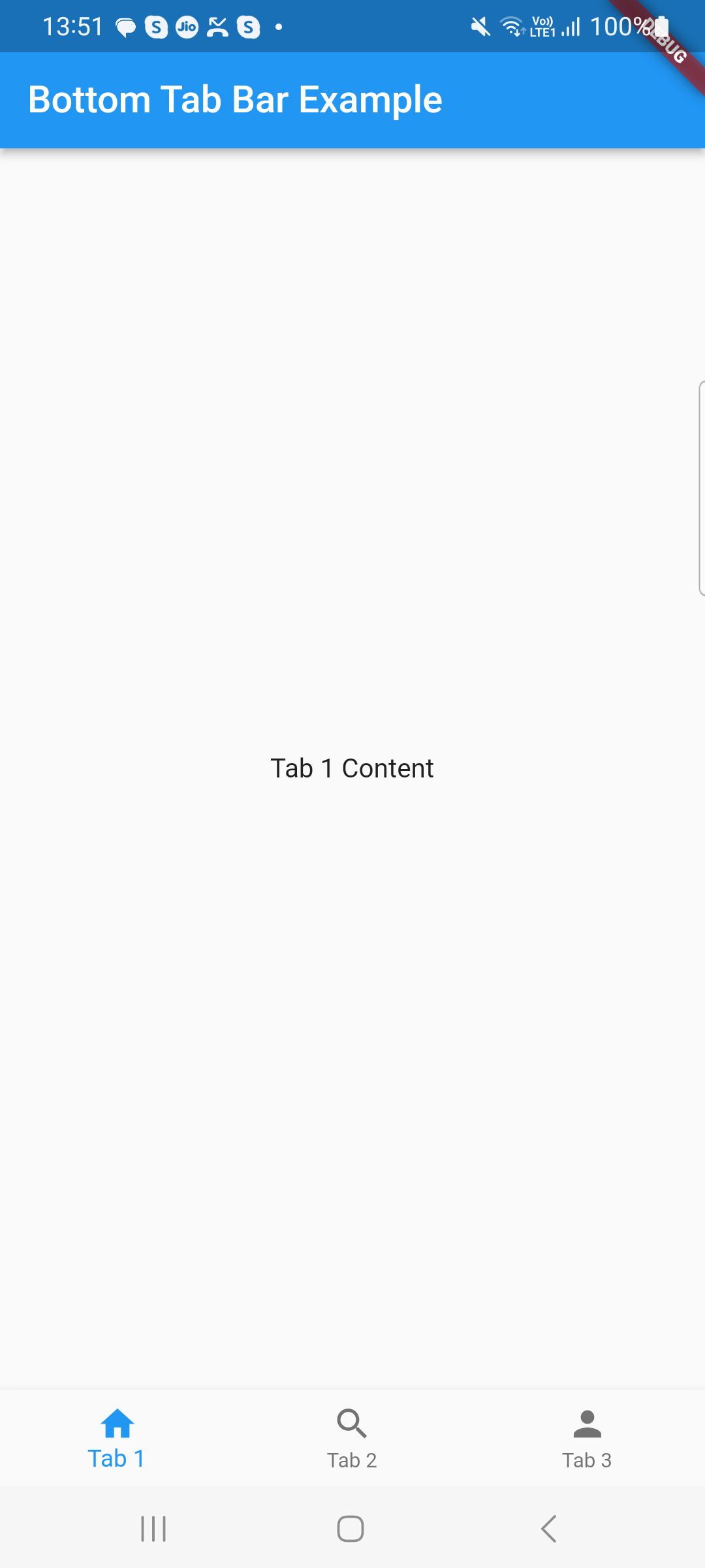
class Tab1 extends StatelessWidget {
@override
Widget build(BuildContext context) {
return Center(
child: Text('Tab 1 Content'),
);
}
}
class Tab2 extends StatelessWidget {
@override
Widget build(BuildContext context) {
return Center(
child: Text('Tab 2 Content'),
);
}
}
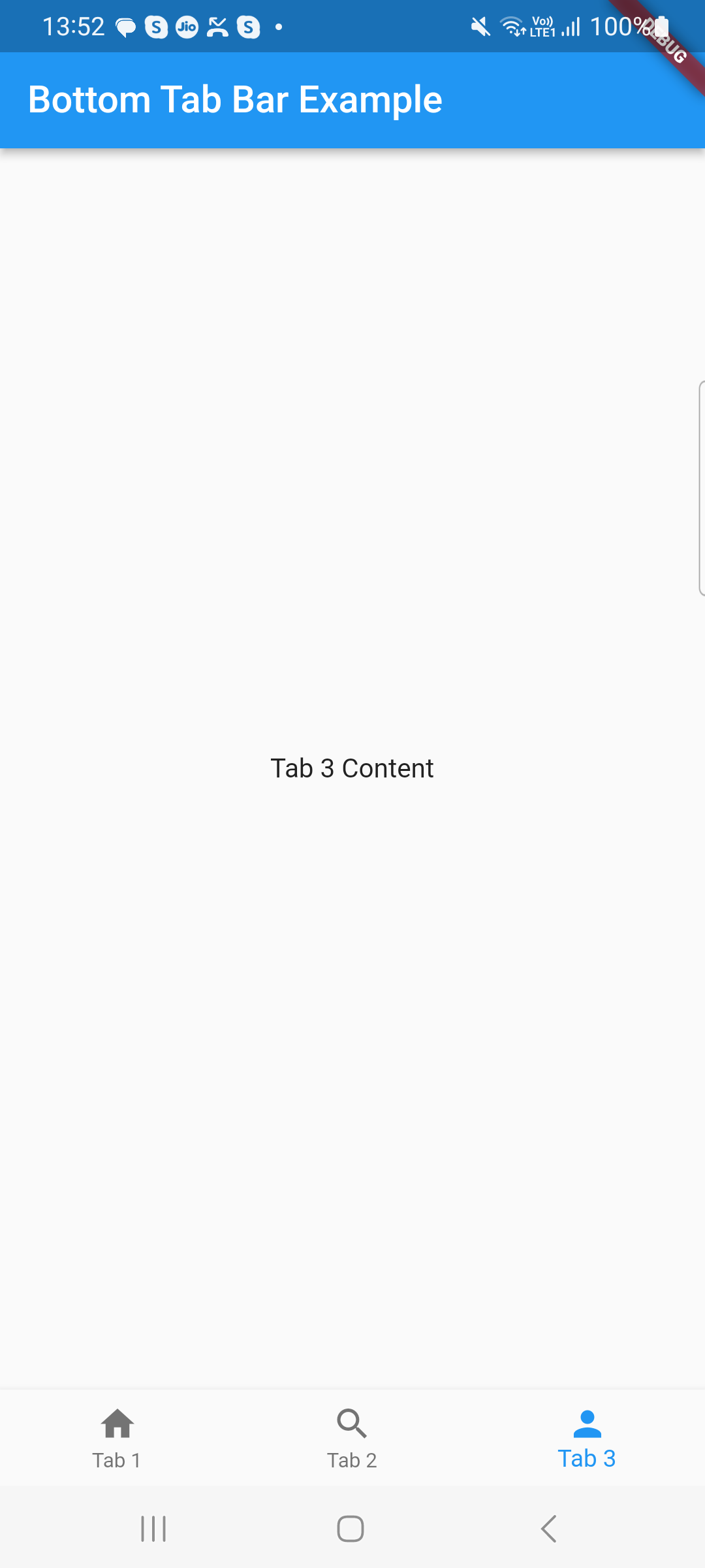
class Tab3 extends StatelessWidget {
@override
Widget build(BuildContext context) {
return Center(
child: Text('Tab 3 Content'),
);
}
}
Explaination of that code
The root widget of the Flutter app created in this code is a MaterialApp. To control the status of the bottom tab bar, we construct a MyHomePage widget that extends StatefulWidget inside of it.
Users can switch between tabs by using the BottomNavigationBar widget, which is added to the Scaffold’s bottomNavigationBar property. Using BottomNavigationBarItem, we create three tabs, each with a label and an icon.
The currently chosen tab is tracked by the BottomNavigationBar’s currentIndex attribute. The state is updated and the current tab is modified by the onTap callback.
Each tab’s content is represented by a different widget (Tab1, Tab2, Tab3). For each tab, you can swap out these widgets with your own original content.
Output :
Related Posts
Progress Bars Example in Flutter
Creating a Splash Screen in Flutter
Remove DEBUG Banner in the Flutter app
Rounded Corners Image in Flutter