
The Row widget is a powerful tool for creating adaptable and responsive user interfaces in the realm of Flutter. Knowing the ins and outs of the Row widget will help you create anything from a straightforward login form to a sophisticated navigation bar, considerably improving your UI development abilities.
In this tutorial, we’ll go in-depth on the Row widget, going over its features and giving you real-world examples to show you what it can do.
What is the Row Widget ?
The Row widget in Flutter is designed to arrange its children horizontally in a linear layout. It’s an essential tool for creating rows of elements that automatically adapt to different screen sizes and orientations. Think of it as a horizontal counterpart to the Column widget.
Properties of the Row Widget
Before we jump into examples, let’s understand some key properties of the Row widget:
- mainAxisAlignment: This property controls the alignment of children along the main axis, which is horizontal in the case of a Row. You can choose values like
start,center,end,spaceBetween, andspaceEvenly. - crossAxisAlignment: Determines how children are aligned along the cross axis (vertical axis in a Row). Common values include
start,center,end, andstretch. - mainAxisSize: Specifies the main axis size behavior of the Row. You can use
MainAxisSize.minto make the Row take up the minimum space required by its children, orMainAxisSize.maxto make it take up the available horizontal space. - textDirection: Defines the reading direction for the children, which is useful when dealing with internationalization or right-to-left languages.
- verticalDirection: Controls the order in which children are laid out vertically. Use
VerticalDirection.downfor top-to-bottom layout orVerticalDirection.upfor bottom-to-top. - children: This is where you provide a list of widgets that you want to arrange horizontally within the Row.
Syntax
Row(
  children: const <Widget>[
    //some widgets
  ],
)
Example 1: Basic Row Layout
Row(
  mainAxisAlignment: MainAxisAlignment.spaceBetween,
  children: <Widget>[
    Container(width: 50, height: 50, color: Colors.red),
    Container(width: 50, height: 50, color: Colors.green),
    Container(width: 50, height: 50, color: Colors.blue),
  ],
)
In this example, we use MainAxisAlignment.spaceBetween to evenly space out the three colored containers within the Row.
Example 2: Custom Alignment and Cross Axis Alignment
Row(
  mainAxisAlignment: MainAxisAlignment.center,
  crossAxisAlignment: CrossAxisAlignment.end,
  children: <Widget>[
    Container(width: 80, height: 100, color: Colors.orange),
    Container(width: 60, height: 80, color: Colors.purple),
    Container(width: 40, height: 60, color: Colors.yellow),
  ],
)
This demonstrates how you can customize both the main and cross-axis alignments of the Row’s children.
Example 3: Responsive Row with Expanded Widgets
Row(
  children: <Widget>[
    Expanded(child: Container(height: 70, color: Colors.teal)),
    Expanded(child: Container(height: 100, color: Colors.indigo)),
    Expanded(child: Container(height: 50, color: Colors.cyan)),
  ],
)
In this example, we use the Expanded widget to make sure each container takes an equal portion of the available horizontal space.
Here’s the full example code for the tutorial:
import 'package:flutter/material.dart';
void main() {
runApp(MyApp());
}
class MyApp extends StatelessWidget {
@override
Widget build(BuildContext context) {
return MaterialApp(
title: 'Row Widget Example',
home: MyHomePage(),
);
}
}
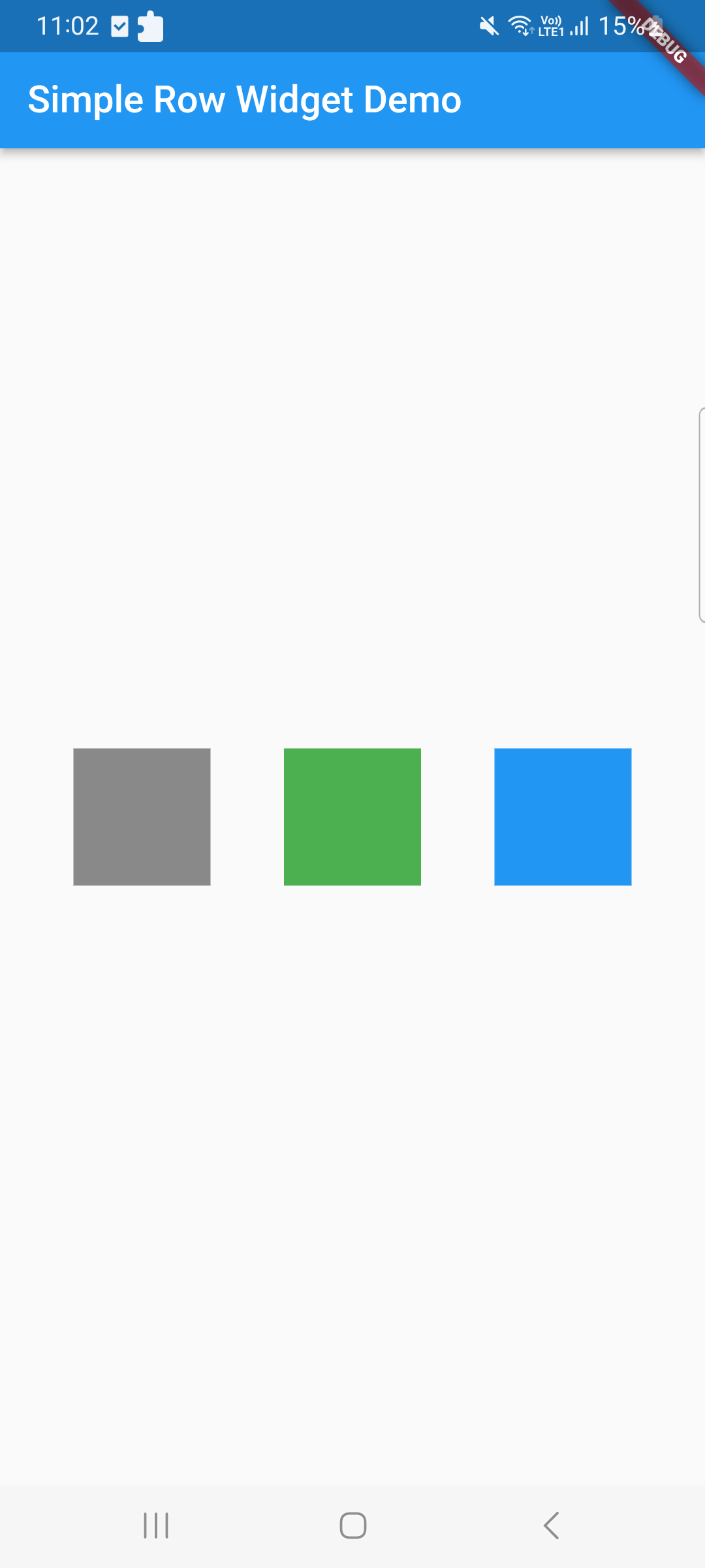
class MyHomePage extends StatelessWidget {
@override
Widget build(BuildContext context) {
return Scaffold(
appBar: AppBar(
title: Text('Simple Row Widget Demo'),
),
body: Center(
child: Row(
mainAxisAlignment: MainAxisAlignment.spaceEvenly,
children: <Widget>[
Container(
width: 80,
height: 80,
color: Colors.black45,
),
Container(
width: 80,
height: 80,
color: Colors.green,
),
Container(
width: 80,
height: 80,
color: Colors.blue,
),
],
),
),
);
}
}
Conclusion
The Row widget in Flutter is a powerful tool that can help you create dynamic and responsive user interfaces. By mastering its properties and understanding its behavior, you’ll be able to build beautifully aligned rows of widgets that adapt seamlessly to various screen sizes and orientations. Experiment with different properties and combinations to achieve the desired layouts for your Flutter apps. Happy coding!
Remember, this tutorial only scratches the surface of what you can achieve with the Row widget. Keep exploring and pushing the boundaries of your UI design skills to create stunning Flutter applications.
Related Posts
Flutter RangeSlider Widget Tutorial