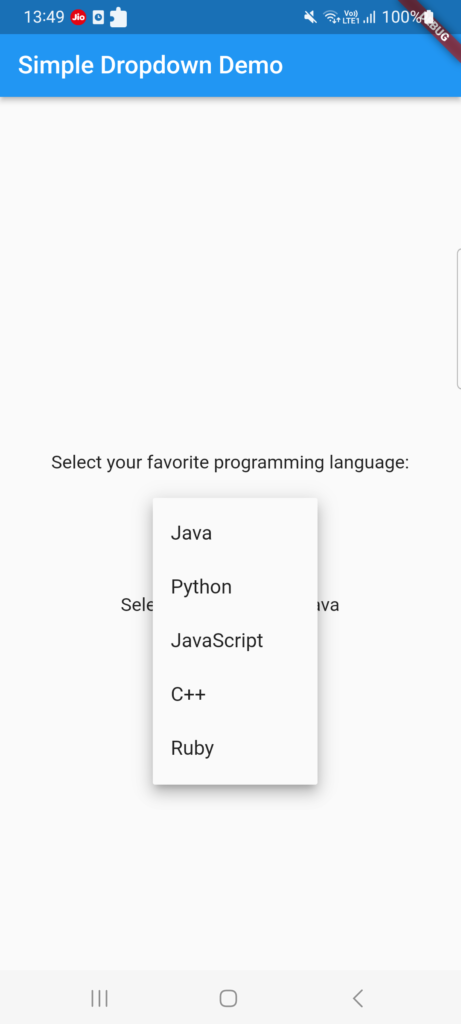
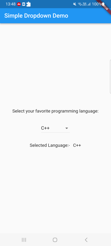
The DropdownButton widget in Flutter provides a convenient and interactive way to select an item from a list of options.
It displays a dropdown menu with selectable items and allows users to make a single selection. In this article, we will explore the key features and usage of the DropdownButton widget in Flutter.
Basic Usage
Make sure Flutter is installed before starting a new Flutter project and using the DropdownButton widget. Afterward, import the DropdownButton widget from the material.dart package. Here is an illustration of how to import the package:
import 'package:flutter/material.dart';
The widget in your widget tree called DropdownButton. Here is a simple Example:
String _selectedItem = 'Option 1';

DropdownButton<String>(
  value: _selectedItem,
  onChanged: (String? newValue) {
    setState(() {
      _selectedItem = newValue!;
    });
  },
  items: <String>['Option 1', 'Option 2', 'Option 3', 'Option 4']
      .map<DropdownMenuItem<String>>((String value) {
    return DropdownMenuItem<String>(
      value: value,
      child: Text(value),
    );
  }).toList(),
)
Customization Options
The DropdownButton widget offers several properties that allow you to customize its appearance and behavior. Let’s explore some of the commonly used properties:
value
The value property represents the currently selected item. It should be set to a value from the provided list of items. You can update the selected item by modifying this property in response to user interactions.
onChanged
The onChanged property is a callback function that is triggered when the user selects a new item from the dropdown menu. You can perform actions or update the UI based on the user’s selection inside this callback.
items
The items property accepts a list of DropdownMenuItem widgets, which define the options available in the dropdown menu. Each DropdownMenuItem contains a value and a child widget. The value represents the value of the item, and the child widget represents the visual representation of the item in the dropdown menu.
hint
The hint property allows you to provide a hint or placeholder text that is displayed when no item is selected. It is typically used to provide context or instructions to the user.
disabledHint
The disabledHint property specifies a hint that is displayed when the dropdown button is disabled. It is useful when you want to show a different hint text when the dropdown is disabled.
Additional Customization
The DropdownButton widget provides more customization options such as icon, iconDisabledColor, iconEnabledColor, isDense, and more. These properties allow you to customize the appearance and behavior of the dropdown button to fit your specific design requirements.
Here are the simple example of Dropdown Widget in Flutter Application. You can implement the basic things of that.
Example: Creating a Simple Dropdown Menu
import 'package:flutter/cupertino.dart';
import 'package:flutter/material.dart';

class DropdownDisplay extends StatefulWidget {
  @override
  DropdownDisplayState createState() => DropdownDisplayState();
}

class DropdownDisplayState extends State<DropdownDisplay> {
  String _selectedLanguage = 'Java';
  List<String> lst_LanguageName = [
    'Java',
    'Python',
    'JavaScript',
    'C++',
    'Ruby'
  ];

  @override
  Widget build(BuildContext context) {
    return Scaffold(
        appBar: AppBar(
          title: Text('Simple Dropdown Demo'),
          automaticallyImplyLeading: false,
        ),
        body: Center(
          child: Column(
            mainAxisAlignment: MainAxisAlignment.center,
            children: <Widget>[
              Text(
                'Select your favorite programming language:',
                style: TextStyle(fontSize: 15.0),
              ),
              SizedBox(height: 30.0),
              DropdownButton<String>(
                value: _selectedLanguage,
                onChanged: (String? newValue) {
                  setState(() {
                    _selectedLanguage = newValue!;
                  });
                },
                items: lst_LanguageName
                    .map<DropdownMenuItem<String>>((String value) {
                  return DropdownMenuItem<String>(
                    value: value,
                    child: Text(value),
                  );
                }).toList(),
              ),
              SizedBox(height: 30.0),
              Text(
                'Selected Language:-   $_selectedLanguage',
                style: TextStyle(fontSize: 15.0),
              ),
            ],
          ),
        ));
  }
}
Conclusion
The DropdownButton widget in Flutter is a powerful tool for providing user-friendly selection options in your applications. With its customizable properties and intuitive interface, you can create dropdown menus that enhance the user experience.
Related Posts
Creating a Snackbar in Flutter
StartActivityForResult in Flutter


