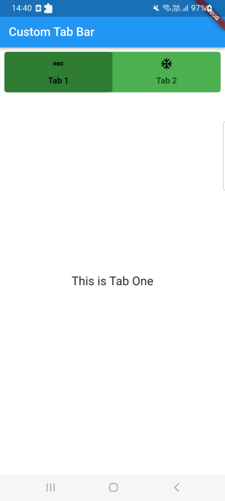
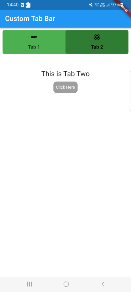
This post will discuss custom tab bars and show you how to make tab bars inside of tab bars. Making a tab bar is extremely simple; all you need to do is return the default controller, specify the length, and build the tab bar. You can also refer this article of Work with Tabs.
While Flutter comes with a default TabBar widget, there may be times when you want to design or programme an own tab bar. This tutorial will show you how to design a unique tab bar in Flutter.
However, in this post, we’ll look at how to make a tab bar, customise it to suit your needs, and add a subtab bar to it.
The tabbar is one of the most popular widgets in the flutter app, and most businesses favour using it in their software.
Open the lib/main.dart file and replace its contents with the following code:
import 'package:flutter/material.dart';

void main() {
  runApp(MyApp());
}

class MyApp extends StatelessWidget {
  @override
  Widget build(BuildContext context) {
    return MaterialApp(
      title: 'Custom Tab Bar',
      theme: ThemeData(
        primarySwatch: Colors.blue,
      ),
      home: MainCustomTab(),
    );
  }
}
In this code, we’ve created a basic MyApp widget that sets up the Flutter app’s structure. The MainCustomTab widget is set as the home screen.
Implementing the Custom Tab Bar
Create a new file called main_custom_tab.dart in the lib directory and add the following code:
import 'package:flutter/material.dart';

class MainCustomTab extends StatefulWidget {
  @override
  State<MainCustomTab> createState() => _MyCustomState();
}

class _MyCustomState extends State<MainCustomTab> {
  @override
  Widget build(BuildContext context) {
    return DefaultTabController(
      length: 2,
      child: Scaffold(
        backgroundColor: Colors.white,
        appBar: AppBar(
          title: Text("Custom Tab Bar"),
          automaticallyImplyLeading: false,
        ),
        body: Padding(
          padding: const EdgeInsets.all(8.0),
          child: Column(
            crossAxisAlignment: CrossAxisAlignment.start,
            children: [
              Container(
                decoration: BoxDecoration(
                  borderRadius: BorderRadius.circular(5),
                  color: Colors.green,
                ),
                child: TabBar(
                  indicator: BoxDecoration(
                    color: Colors.green[800],
                    borderRadius: BorderRadius.circular(5),
                  ),
                  labelColor: Colors.black,
                  tabs: [
                    Tab(
                      child: Text("Tab 1"),
                      icon: Icon(
                        Icons.abc_sharp,
                        color: Colors.black,
                      ),
                    ),
                    Tab(
                      child: Text("Tab 2"),
                      icon: Icon(
                        Icons.ac_unit_sharp,
                        color: Colors.black,
                      ),
                    ),
                  ],
                ),
              ),
              Expanded(
                child: TabBarView(children: [
                  MyTabOne(),
                  MyTabTwo(),
                ]),
              )
            ],
          ),
        ),
      ),
    );
  }
}

class MyTabOne extends StatelessWidget {
  const MyTabOne({super.key});

  @override
  Widget build(BuildContext context) {
    return Center(
        child: Text(
      "This is Tab One",
      style: TextStyle(fontSize: 20),
    ));
  }
}

class MyTabTwo extends StatelessWidget {
  const MyTabTwo({super.key});

  @override
  Widget build(BuildContext context) {
    return Container(
      color: Colors.white,
      margin: EdgeInsets.fromLTRB(0, 50, 0, 0),
      child: Column(
        children: [
          Center(
              child: Text(
            "This is Tab Two",
            style: TextStyle(fontSize: 20),
          )),
          Container(
            padding: EdgeInsets.fromLTRB(5, 0, 5, 0),
            margin: EdgeInsets.fromLTRB(5, 5, 5, 0),
            child: TextButton(
              style: TextButton.styleFrom(
                shadowColor: Colors.black,
                textStyle: TextStyle(fontSize: 20),
                primary: Colors.white,
                shape: RoundedRectangleBorder(
                  borderRadius: BorderRadius.circular(10.0),
                ),
                backgroundColor: Colors.grey,
              ),
              onPressed: () async {
                print("Click Here");
              },
              child: Text(
                "Click Here",
                style: TextStyle(color: Colors.white, fontSize: 12),
              ),
            ),
          ),
        ],
      ),
    );
  }
}
I’ve written all of my code in this file, but you could make a separate file for that.
Output:
In this article, we learnt how to use the TabBar and TabBarView widgets to build a custom tab bar in Flutter.
We looked into altering the tab bar’s visual style and showed various content on each tab. Feel free to play around with various layouts and improve the usability of your personalised tab bar.
Related Posts


