Custom Tab Bar in Flutter

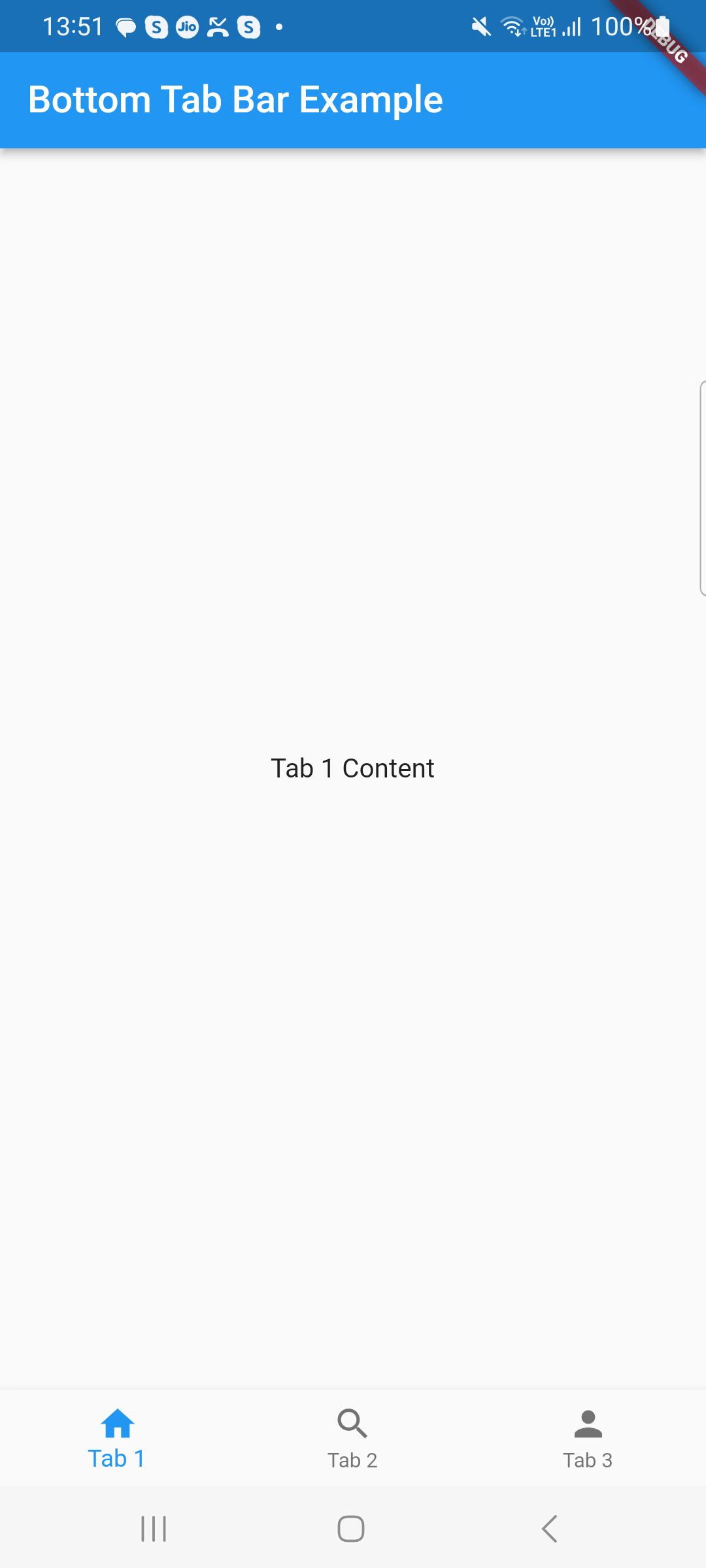
This post will discuss custom tab bars and show you how to make tab bars inside of tab bars. Making a tab bar is extremely simple; all you need to do is return the default controller, specify the length, and build the tab bar. You can also refer this article of Work with Tabs.

While Flutter comes with a default TabBar widget, there may be times when you want to design or programme an own tab bar. This tutorial will show you how to design a unique tab bar in Flutter.

However, in this post, we’ll look at how to make a tab bar, customise it to suit your needs, and add a subtab bar to it.

The tabbar is one of the most popular widgets in the flutter app, and most businesses favour using it in their software.

Open the lib/main.dart file and replace its contents with the following code:

import 'package:flutter/material.dart';

void main() {
  runApp(MyApp());
}

class MyApp extends StatelessWidget {
  @override
  Widget build(BuildContext context) {
    return MaterialApp(
      title: 'Custom Tab Bar',
      theme: ThemeData(
        primarySwatch: Colors.blue,
      ),
      home: MainCustomTab(),
    );
  }
}

In this code, we’ve created a basic MyApp widget that sets up the Flutter app’s structure. The MainCustomTab widget is set as the home screen.

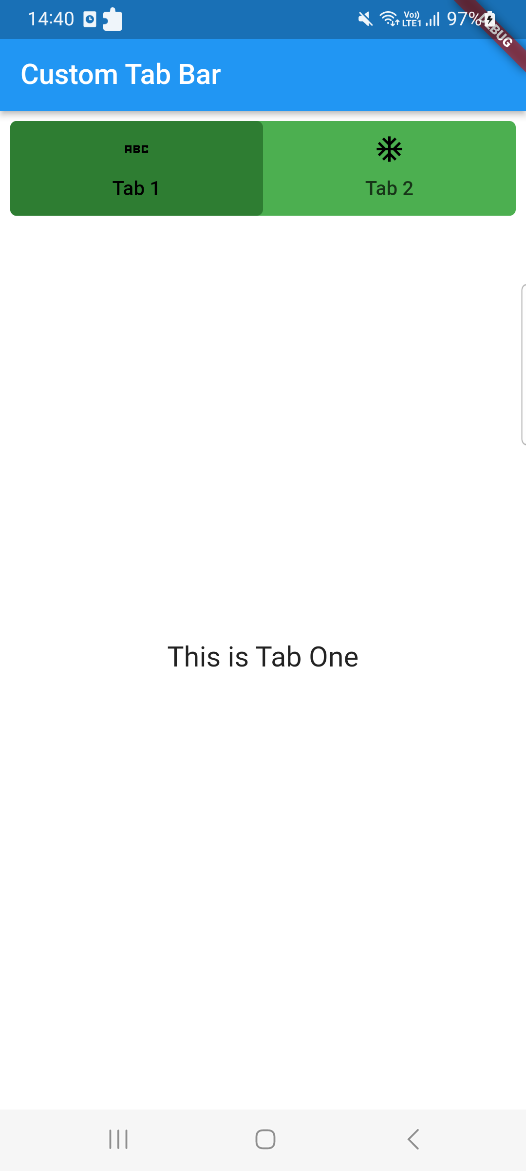
Implementing the Custom Tab Bar

Create a new file called main_custom_tab.dart in the lib directory and add the following code:

import 'package:flutter/material.dart';

class MainCustomTab extends StatefulWidget {
  @override
  State<MainCustomTab> createState() => _MyCustomState();
}

class _MyCustomState extends State<MainCustomTab> {
  @override
  Widget build(BuildContext context) {
    return DefaultTabController(
      length: 2,
      child: Scaffold(
        backgroundColor: Colors.white,
        appBar: AppBar(
          title: Text("Custom Tab Bar"),
          automaticallyImplyLeading: false,
        ),
        body: Padding(
          padding: const EdgeInsets.all(8.0),
          child: Column(
            crossAxisAlignment: CrossAxisAlignment.start,
            children: [
              Container(
                decoration: BoxDecoration(
                  borderRadius: BorderRadius.circular(5),
                  color: Colors.green,
                ),
                child: TabBar(
                  indicator: BoxDecoration(
                    color: Colors.green[800],
                    borderRadius: BorderRadius.circular(5),
                  ),
                  labelColor: Colors.black,
                  tabs: [
                    Tab(
                      child: Text("Tab 1"),
                      icon: Icon(
                        Icons.abc_sharp,
                        color: Colors.black,
                      ),
                    ),
                    Tab(
                      child: Text("Tab 2"),
                      icon: Icon(
                        Icons.ac_unit_sharp,
                        color: Colors.black,
                      ),
                    ),
                  ],
                ),
              ),
              Expanded(
                child: TabBarView(children: [
                  MyTabOne(),
                  MyTabTwo(),
                ]),
              )
            ],
          ),
        ),
      ),
    );
  }
}

class MyTabOne extends StatelessWidget {
  const MyTabOne({super.key});

  @override
  Widget build(BuildContext context) {
    return Center(
        child: Text(
      "This is Tab One",
      style: TextStyle(fontSize: 20),
    ));
  }
}

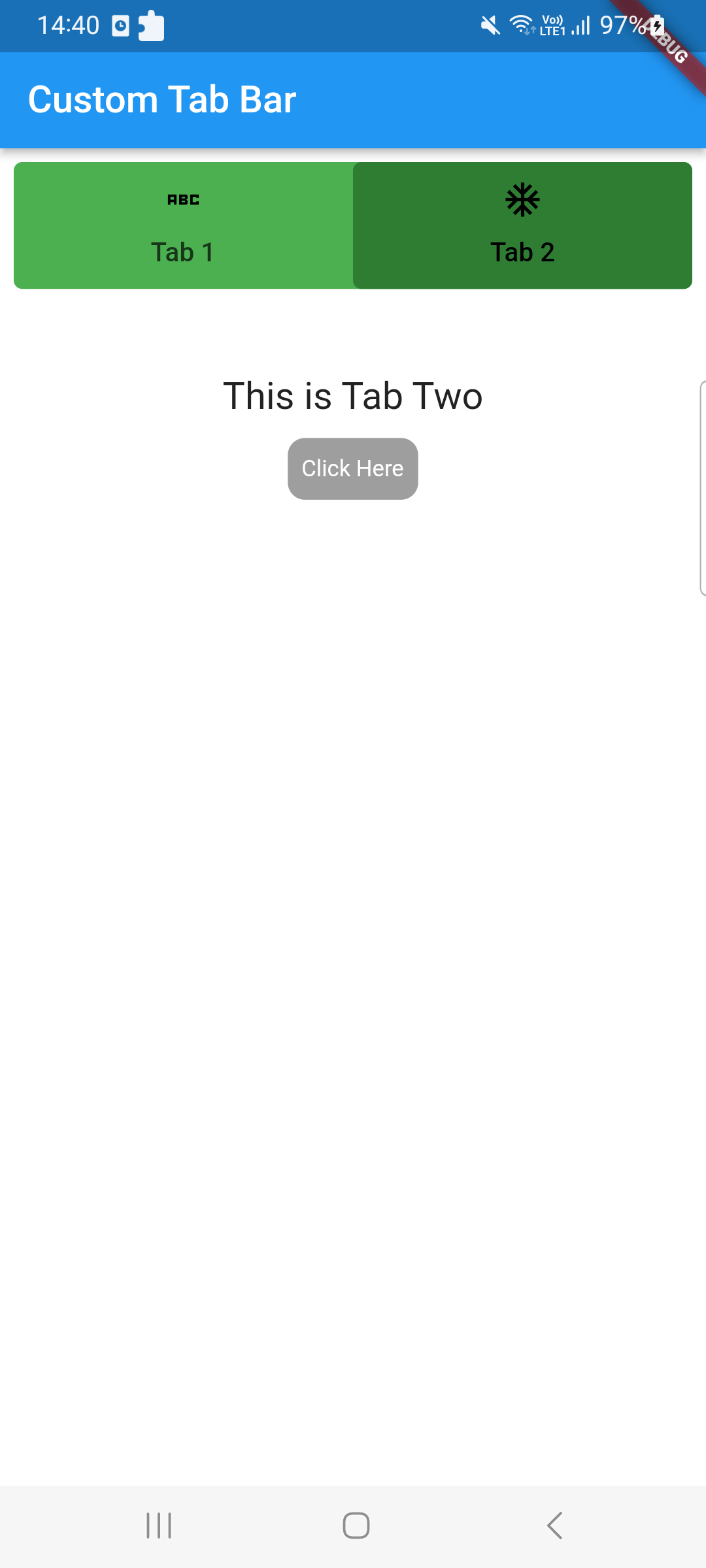
class MyTabTwo extends StatelessWidget {
  const MyTabTwo({super.key});

  @override
  Widget build(BuildContext context) {
    return Container(
      color: Colors.white,
      margin: EdgeInsets.fromLTRB(0, 50, 0, 0),
      child: Column(
        children: [
          Center(
              child: Text(
            "This is Tab Two",
            style: TextStyle(fontSize: 20),
          )),
          Container(
            padding: EdgeInsets.fromLTRB(5, 0, 5, 0),
            margin: EdgeInsets.fromLTRB(5, 5, 5, 0),
            child: TextButton(
              style: TextButton.styleFrom(
                shadowColor: Colors.black,
                textStyle: TextStyle(fontSize: 20),
                primary: Colors.white,
                shape: RoundedRectangleBorder(
                  borderRadius: BorderRadius.circular(10.0),
                ),
                backgroundColor: Colors.grey,
              ),
              onPressed: () async {
                print("Click Here");
              },
              child: Text(
                "Click Here",
                style: TextStyle(color: Colors.white, fontSize: 12),
              ),
            ),
          ),
        ],
      ),
    );
  }
}

I’ve written all of my code in this file, but you could make a separate file for that.

Output:

In this article, we learnt how to use the TabBar and TabBarView widgets to build a custom tab bar in Flutter.

We looked into altering the tab bar’s visual style and showed various content on each tab. Feel free to play around with various layouts and improve the usability of your personalised tab bar.

Related Posts

Bottom Tab Bar in Flutter

Tabbar with image in flutter

Simple Tabbar in Flutter

Progress Bars Example in Flutter

Bottom Tab Bar in Flutter

For navigating between various UIs, the BottomNavigationBar has gained popularity in recent years.

Since the majority of apps now use this widget to switch between screens, many developers use bottom navigation.

Flutter’s bottom navigation bar can include a variety of things, including text labels, icons, or both.

It enables easy switching between an app’s top-level views for the user. It is preferable to use a side navigation bar while utilising a larger screen.

In Flutter applications, the scaffold widget is typically set in conjunction with the bottom navigation bar. To set the bottom navigation bar, use the Scaffold widget’s Scaffold.bottomNavigationBar parameter.

It should be noted that adding the BottomNavigationBar alone will not cause the navigation elements to appear. For Items properties that take a list of BottomNavigationItems widgets, the BottomNavigationItems property must be set.

BottomNavigationBar Widget properties

BottomNavigationBarItem({  
    @required this.icon,  
    this.title,  
    Widget activeIcon,  
    this.backgroundColor,  
  })

Creating the Bottom Tab Bar Example Given below:

Open the lib/main.dart file in your project directory and replace the code with the following:

import 'package:flutter/cupertino.dart';
import 'package:flutter/material.dart';

class TabbarDisplay extends StatefulWidget {
  @override
  TabbarDisplayState createState() =&gt; TabbarDisplayState();
}

class TabbarDisplayState extends State&lt;TabbarDisplay&gt; {
  int _currentIndex = 0;
  final List&lt;Widget&gt; _tabs = [
    Tab1(),
    Tab2(),
    Tab3(),
  ];

  @override
  Widget build(BuildContext context) {
    return Scaffold(
      appBar: AppBar(
        title: Text('Bottom Tab Bar Example'),
        automaticallyImplyLeading: false,
      ),
      body: _tabs[_currentIndex],
      bottomNavigationBar: BottomNavigationBar(
        currentIndex: _currentIndex,
        onTap: (index) {
          setState(() {
            _currentIndex = index;
          });
        },
        items: [
          BottomNavigationBarItem(
            icon: Icon(Icons.home),
            label: 'Tab 1',
          ),
          BottomNavigationBarItem(
            icon: Icon(Icons.search),
            label: 'Tab 2',
          ),
          BottomNavigationBarItem(
            icon: Icon(Icons.person),
            label: 'Tab 3',
          ),
        ],
      ),
    );
  }
}

class Tab1 extends StatelessWidget {
  @override
  Widget build(BuildContext context) {
    return Center(
      child: Text('Tab 1 Content'),
    );
  }
}

class Tab2 extends StatelessWidget {
  @override
  Widget build(BuildContext context) {
    return Center(
      child: Text('Tab 2 Content'),
    );
  }
}

class Tab3 extends StatelessWidget {
  @override
  Widget build(BuildContext context) {
    return Center(
      child: Text('Tab 3 Content'),
    );
  }
}

Explaination of that code

The root widget of the Flutter app created in this code is a MaterialApp. To control the status of the bottom tab bar, we construct a MyHomePage widget that extends StatefulWidget inside of it.

Users can switch between tabs by using the BottomNavigationBar widget, which is added to the Scaffold’s bottomNavigationBar property. Using BottomNavigationBarItem, we create three tabs, each with a label and an icon.

The currently chosen tab is tracked by the BottomNavigationBar’s currentIndex attribute. The state is updated and the current tab is modified by the onTap callback.

Each tab’s content is represented by a different widget (Tab1, Tab2, Tab3). For each tab, you can swap out these widgets with your own original content.

Output :

Related Posts

Tabbar with image in flutter

Simple Tabbar in Flutter

Progress Bars Example in Flutter

Creating a Splash Screen in Flutter

Remove DEBUG Banner in the Flutter app

Rounded Corners Image in Flutter

Tabbar with image in flutter

Good day, readers A few weeks ago, one of the readers who left a comment on my story requested that I write a piece regarding the TabBar and TabBarView widgets.

So here it is: in addition to addressing these two widgets, we will also speak about the DefaultTabBarController and TabController.

If you dont know how to implement basic Tabbar in Flutter you can check this post of the Simple Tabbar in Flutter.

You might concur with me that designing a tabbed layout in Android is more difficult than it is in Flutter if you are an Android developer.

The basic Syntax of the Tabbar is given below:

TabBar(           
  indicatorColor: Colors.white,
  indicatorWeight: 2.0,
  indicatorPadding: EdgeInsets.zero,
  indicatorSize: TabBarIndicatorSize.label,
  indicator: BoxDecoration(),
  labelColor: Colors.white,
  labelStyle: TextStyle(),
  labelPadding: EdgeInsets.only(top: 10.0),
  unselectedLabelColor: Colors.grey,
  unselectedLabelStyle: TextStyle(),
  isScrollable: false,
  controller: _tabController,  // only  if DefaultTabContoller is not used.
  dragStartBehavior: DragStartBehavior.start,
  mouseCursor: SystemMouseCursors.noDrop,
  physics: ScrollPhysics(parent: AlwaysScrollableScrollPhysics()),
  onTap: (){},
  tabs: [Tab(),]                 // @required list of Tabs

Here is the example of Image on Tabbar in Flutter Implementation.

Open the lib/main.dart file in your project directory and replace the code with the following:

class TabbarDisplay extends StatefulWidget {
  @override
  TabbarDisplayState createState() =&gt; TabbarDisplayState();
}

class TabbarDisplayState extends State<tabbardisplay> {
  @override
  void initState() {
    super.initState();
  }

  @override
  Widget build(BuildContext context) {
    return MaterialApp(
      home: DefaultTabController(
        length: 3, // Number of tabs
        child: Scaffold(
          appBar: AppBar(
            title: Text('Tech Android Hub'),
            bottom: TabBar(
              tabs: [
                Tab(
                  icon: Icon(Icons.add), // Image or Icon you can add 
                  text: 'Tab 1',
                ),
                Tab(
                  icon: Icon(Icons.access_alarm),
                  text: 'Tab 2',
                ),
                Tab(
                  icon: Icon(Icons.ac_unit_rounded),
                  text: 'Tab 3',
                ),
              ],
            ),
          ),
          body: TabBarView(
            children: [
              Center(child: Icon(Icons.add),),
              Center(child: Icon(Icons.access_alarm)),
              Center(child: Icon(Icons.ac_unit_rounded)),
            ],
          ),
        ),
      ),
    );
  }
}</tabbardisplay>

By using the icon attribute, we have modified the previous code in this example to add Icon widgets to each Tab. Alternatively, if you like, you can use a custom icon or any other icon from the Icons class.

The tabbed interface should now appear, with three tabs and an image on each one. Each tab’s associated image will appear in the centre of the screen when it is touched.

For creating complex user interfaces, Flutter offers a flexible and user-friendly framework. You are welcome to try different things, like as changing the graphics on the tabs or including new features in the app.

Related Posts

Simple Tabbar in Flutter

Progress Bars Example in Flutter

Creating a Splash Screen in Flutter

Remove DEBUG Banner in the Flutter app

Rounded Corners Image in Flutter

Simple Tabbar in Flutter

Mobile apps frequently employ tabs as a UI pattern because they make it simple for users to switch between various content parts.

The TabBar and TabBarView widgets in Flutter can be used to build a tabbed interface.

Tabs are precisely what you assume they are. When clicked, it’s a component of the user interface that directs the user through several paths (i.e., pages).

It is common practise to use tabs in applications. Using the material library and Flutter, tab layouts may be easily created. We will investigate the same in detail in this essay.

Make a new Flutter application now. Once the programme is finished, remove all the comments and content until you are left with the following code:

Design of TabController

The TabController, as its name suggests, manages each tab’s operation by synchronising its tabs and contents. One of the simplest methods for creating tabs in flutter is to use the DefaultTabController widget. Below are the full code of Tabbar :

class TabbarDisplay extends StatefulWidget {
  @override
  TabbarDisplayState createState() => TabbarDisplayState();
}

class TabbarDisplayState extends State<tabbardisplay> {
  @override
  void initState() {
    super.initState();
  }

  @override
  Widget build(BuildContext context) {
    return MaterialApp(
      home: DefaultTabController(
        length: 3, // Number of tabs
        child: Scaffold(
          appBar: AppBar(
            title: Text('Tech Android Hub'),
            bottom: TabBar(
              tabs: [
                Tab(text: 'Tab 1'),
                Tab(text: 'Tab 2'),
                Tab(text: 'Tab 3'),
              ],
            ),
          ),
          body: TabBarView(
            children: [
              Center(child: Text('First Tab 1')),
              Center(child: Text('Second Tab 2')),
              Center(child: Text('Third Tab 3')),
            ],
          ),
        ),
      ),
    );
  }
}

In this code, we create a new Flutter application with a MaterialApp as the root widget. Inside it, we use a DefaultTabController to handle the tab logic.

The TabBar widget is placed inside the AppBar and provides the tab titles. We create three Tab widgets, each with a different text label.

The TabBarView widget contains the content of each tab. In this example, we use simple Text widgets wrapped in Center widgets for demonstration purposes. You can replace them with your own content widgets.

You discovered how to use TabBar and TabBarView to build a tabbed interface in Flutter in this tutorial. In developing mobile applications, using tabs to organise content and improve user experience is a great strategy.

Feel free to play around with various content widgets and alter the tab’s layout to fit the style of your app. For building complex and interactive user interfaces, Flutter offers a flexible and user-friendly framework.

Happy coding!

Related Posts

Progress Bars Example in Flutter

Creating a Splash Screen in Flutter

Remove DEBUG Banner in the Flutter app

Rounded Corners Image in Flutter

Example of a checkboxlisttile in flutter