TextField Widget in Flutter

Users can enter text using the TextField widget, which is a core input widget in Flutter.

It is appropriate for a variety of use scenarios because to the flexible collection of characteristics and customization options it offers.

We will examine the main characteristics and attributes of the TextField widget in Flutter in this tutorial.

You must integrate the TextField widget into your Flutter project before you can use it.

Make sure the essential dependencies are installed first. Import the content after that.

Understanding the Properties of TextField in Flutter

1. controller

The controller property of the TextField widget allows you to associate a TextEditingController with the text field. This controller gives you access to the entered text, as well as the ability to modify it programmatically.

2. decoration

The decoration property is used to customize the visual appearance of the text field. It accepts an instance of InputDecoration that allows you to set properties such as the label text, hint text, prefix or suffix icons, border, and more.

3. onChanged

The onChanged callback is triggered whenever the user modifies the text field. It provides the current value of the text field as an argument, allowing you to perform actions based on the user’s input, such as updating UI elements or making API calls.

4. maxLines

The maxLines property specifies the maximum number of lines that the text field can display. Setting it to null allows the user to enter multiple lines of text, creating a multi-line text field.

5. keyboardType

The keyboardType property determines the type of keyboard that is displayed to the user when they focus on the text field. There are various options available, including numeric keyboards, email keyboards, URL keyboards, and more.

6. textCapitalization

The textCapitalization property defines how the entered text should be capitalized. It offers options such as TextCapitalization.none (no capitalization), TextCapitalization.words (capitalize the first letter of each word), TextCapitalization.sentences (capitalize the first letter of each sentence), and TextCapitalization.characters (capitalize every character).

7. style

The style property allows you to specify the text style for the entered text. You can customize properties such as the font size, font weight, color, and more.

8. autofocus

The autofocus property determines whether the text field should automatically receive focus when the widget is first displayed. Setting it to true ensures that the text field is ready for input without requiring an additional tap.

9. obscureText

The obscureText property is used for password fields or any other scenario where you want to hide the entered text. When set to true, the entered text is masked, usually with asterisks or dots.

10. textAlign

The textAlign property defines the alignment of the entered text within the text field. It accepts values such as TextAlign.left, TextAlign.right, TextAlign.center, and TextAlign.justify.

11. maxLength

The maxLength property specifies the maximum number of characters allowed in the text field. You can use this property to enforce a character limit for user input.

12. buildCounter

The buildCounter property allows you to customize the display of the character counter, which indicates the current length of the entered text and the maximum allowed length. You can provide a custom function that returns a widget to define the counter’s appearance.

TextField widget is part of the dart package. Here is an illustration of how to import the package:

import 'package:flutter/material.dart';

Next, you can use the TextField widget in your widget tree. Here’s a basic example:

TextField(
  decoration: InputDecoration(
    labelText: 'Enter your Number',
  ),
)

We constructed a TextField with a straightforward decoration that contains a label text in the aforementioned code snippet.

The user is given a visual signal regarding the text field’s purpose thanks to this.

Controller and Retrieving Input

A TextEditingController can be used to retrieve the user’s input that was entered into the TextField.

You can read the text that has been typed or programmatically alter it using this controller. Here’s an illustration of how a controller is used:

TextEditingController _textEditingController = TextEditingController();

TextField(
  controller: _textEditingController,
  decoration: InputDecoration(
    labelText: 'Enter your Number',
  ),
)

We built a TextEditingController with the number _textEditingController and applied it to the TextField’s controller property in the code above.

By using _textEditingController.text, you may get at the text that was typed.

Handling User Input

The onChanged callback, which is offered by the TextField widget, is triggered anytime the user makes changes to the text field.

You can take actions based on the user’s input with this callback. Here’s an illustration:

TextField(
  onChanged: (value) {
    print('User input: $value');
  },
  decoration: InputDecoration(
    labelText: 'Enter your name',
  ),
)

The onChanged callback, which prints the entered text anytime the user edits the text field, is included in the code excerpt above.

You can use your own logic to update UI components or access APIs in place of the print statement.

Related Posts

TextButton Widget in Flutter

Creating a Snackbar in Flutter

StartActivityForResult in Flutter

Custom Tabbar in Flutter

Bottom Tab Bar in Flutter

Tabbar with image in flutter

TextButton Widget in Flutter

A TextButton widget is nothing more than a text label visible on a Material widget with no elevation.

It has no apparent borders by default and fills with a backdrop colour when touched.

FlatButton is no longer supported and should not be used in new projects; TextButton is the successor for this once-famous widget.

Note: TextButton requires Flutter 1.22.0 or newer to function properly without displaying obtrusive errors or warnings. The examples in this post have recently been modified to function properly with Flutter 3.3.10+.

TextButton Syntax

TextButton({
  Key? key, 
  required VoidCallback? onPressed, 
  VoidCallback? onLongPress, 
  ValueChanged<bool>? onHover, 
  ValueChanged<bool>? onFocusChange, 
  ButtonStyle? style, 
  FocusNode? focusNode, 
  bool autofocus = false, 
  Clip clipBehavior = Clip.none, 
  MaterialStatesController? statesController, 
  required Widget child
})

Simple Textbutton Implementation Example :

TextButton(
    onPressed: () {},
    child: const Text('Normal Button'),
),

Textbutton with Icon Example

TextButton.icon(
    icon: const Icon(Icons.browse_gallery),
    label: const Text('Go To Gallery'),
    onPressed: () {},
)

Disable a TextButton Example

A non-responsive button is one that has been disabled. Simply set onPressed and onLongPress to null (onLongPress is null by default) to make a text button inactive.

Column(
        children: [
          const TextButton(
            onPressed: null, // For Disable Button you can set null
            child: Text('Check Disabled Button'),
          ),
          TextButton(
            onPressed: () {}, // For Enable Button 
            child: const Text('Check Enabled Button'),
          ),
          TextButton.icon(
              onPressed: null, // For Disable Button you can set null
              icon: const Icon(Icons.cancel),
              label: const Text('Check Disabled Icon Button')),
          TextButton.icon(
              onPressed: () {}, // For Enable Button 
              icon: const Icon(Icons.pause),
              label: const Text('Check Enabled Icon Button'))
        ],
),

Style a TextButton Syntax

styleFrom({
  Color? foregroundColor, 
  Color? backgroundColor, 
  Color? disabledForegroundColor, 
  Color? disabledBackgroundColor, 
  Color? shadowColor, 
  Color? surfaceTintColor, 
  double? elevation, 
  TextStyle? textStyle, 
  EdgeInsetsGeometry? padding, 
  Size? minimumSize, 
  Size? fixedSize, 
  Size? maximumSize, 
  BorderSide? side, 
  OutlinedBorder? shape, 
  MouseCursor? enabledMouseCursor, 
  MouseCursor? disabledMouseCursor, 
  VisualDensity? visualDensity, 
  MaterialTapTargetSize? tapTargetSize, 
  Duration? animationDuration, 
  bool? enableFeedback, 
  AlignmentGeometry? alignment, 
  InteractiveInkFeatureFactory? splashFactory, 
  Color? primary, 
  Color? onSurface
})

In the following example, an italic font button with an amber backdrop is created:

TextButton(
            onPressed: () {},
            style: TextButton.styleFrom(
                foregroundColor: Colors.green,
                backgroundColor: Colors.blue,
                textStyle:
                    const TextStyle(fontSize: 24, fontStyle: FontStyle.bold)),
            child: const Text(
              'Main Button',
            ),
),

By utilising the fixedSize option in the following manner, you can size a TextButton precisely as you desire:

TextButton(
        style: TextButton.styleFrom(
            fixedSize: const Size(250, 100),
            backgroundColor: Colors.blue,
            foregroundColor: Colors.black,
            textStyle: const TextStyle(fontSize: 25)),
        onPressed: () {},
        child: const Text('Click'),
)

By changing its properties, you can alter the TextButton’s appearance. You may add an icon or alter the text style or colour of the button, for instance. Feel free to play around with various parameters to get the desired appearance and behaviour.

Related Posts

Creating a Snackbar in Flutter

StartActivityForResult in Flutter

Custom Tabbar in Flutter

Bottom Tab Bar in Flutter

Tabbar with image in flutter

Progress Bars Example in Flutter

Creating a Snackbar in Flutter

Flutter’s Snackbar widget lets you show a pop-up notification that users may close from within your application.

It is employed to display to users whether specific activities occur in our programmes.

For instance, if the user login process fails for some reason, we can use the snackbar to tell the user to try again. It appears on the screen and has additional functions like the ability to reverse a previously executed action.

Snackbar briefly displays the educational message before it automatically disappears at the end of the allotted time. The ideal onscreen duration for a snackbar is 5 to 10 seconds. It is offered in the flutter libraries’ material package.

You must import “package:flutter/material.dart” to use a snackbar. Syntax of the snackbar is given below.

SnackBar({Key key, 
@required Widget content, 
Color backgroundColor, 
double elevation, 
EdgeInsetsGeometry margin, 
EdgeInsetsGeometry padding, 
double width, 
ShapeBorder shape, 
SnackBarBehavior behavior, 
SnackBarAction action, 
Duration duration: _snackBarDisplayDuration, 
Animation<double> animation, 
VoidCallback onVisible})

Here are the properties descriptions

  • action: Action to perform based on snackbar.
  • animation: Entry and the exit animation of snackbar.
  • backgroundcolor: Snackbar background color
  • behavior: Behavior and location of snackbar.
  • content: Content of snackbar.
  • duration: The amount of time snackbar should be displayed.
  • elevation: Elevates the snackbar by increasing shadow.
  • margin: Space around snackbar.
  • onVisible: Called the first time that the snackbar is visible within a scaffold.
  • padding: space around content inside snackbar.
  • shape: Shape of snackbar.
  • width: Width of snackbar.

Here is the basic example of the snackbar given below.

class SnackbarDisplay extends StatefulWidget {
  @override
  SnackbarDisplayState createState() => SnackbarDisplayState();
}

class SnackbarDisplayState extends State<SnackbarDisplay> {
  @override
  Widget build(BuildContext context) {
    return Scaffold(
        appBar: AppBar(
          title: Text('Snackbar Demo'),
          automaticallyImplyLeading: false,
        ),
        body: Center(
            child: Column(
          children: [
            Container(
              padding: EdgeInsets.fromLTRB(5, 0, 5, 0),
              margin: EdgeInsets.fromLTRB(5, 5, 5, 0),
              child: TextButton(
                style: TextButton.styleFrom(
                  shadowColor: Colors.black,
                  textStyle: TextStyle(fontSize: 20),
                  shape: RoundedRectangleBorder(
                    borderRadius: BorderRadius.circular(10.0),
                  ),
                  backgroundColor: Colors.black45,
                ),
                onPressed: () async {
                  final snackBar = SnackBar(
                    content: Text('This is a snackbar'),
                  );
                  ScaffoldMessenger.of(context).showSnackBar(snackBar);
                },
                child: Text(
                  "Show Snackbar",
                  style: TextStyle(color: Colors.white, fontSize: 12),
                ),
              ),
            ),
          ],
        )));
  }
}

The snackbar is also customizable. Similar to changing a colour or adding a button, you may alter the snackbar’s duration. In order for you to customise it to meet your needs.

final snackBar = SnackBar(
  content: Text('This is a customize snackbar'),
  backgroundColor: Colors.blue,
  duration: Duration(seconds: 3),
  action: SnackBarAction(
    label: 'Dismiss',
    onPressed: () {
      // Perform action when the action button is pressed
    },
  ),
);

That code can be added to the onPressed method.

Your Flutter application’s snackbar has been successfully established. Snackbars are a fantastic method to give users momentary feedback or notifications. To improve the user experience, feel free to test out various customizations.

Recall that snackbars are merely one of the numerous UI elements offered by Flutter. For Flutter to help you create incredible applications, keep exploring and experimenting!

Related Posts

StartActivityForResult in Flutter

Custom Tabbar in Flutter

Bottom Tab Bar in Flutter

Tabbar with image in flutter

Simple Tabbar in Flutter

Progress Bars Example in Flutter

StartActivityForResult in Flutter

The startActivityForResult function, which enables you to launch a new activity and receive a result back in the original activity, is one of the helpful tools in Android programming.

Although there isn’t a direct Flutter equivalent to this technique, we can accomplish a comparable feature by utilising callbacks and navigation in Flutter. We’ll look at how to use Flutter to construct a similar pattern in this article.

We can using callback functionality in Flutter applications.

Create one file StartActivityResultDetails.dart. Put below code of that.

class StartActivityResultDetails extends StatefulWidget {
  @override
  StartActivityDisplayState createState() => StartActivityDisplayState();
}

class StartActivityDisplayState extends State<StartActivityResultDetails> {
  Map str_Callback = {"Title": "Welcome India"};

  @override
  Widget build(BuildContext context) {
    return Scaffold(
        appBar: AppBar(
          title: Text('First Page'),
          automaticallyImplyLeading: false,
        ),
        body: Center(
            child: Column(
          children: [
            Container(
              padding: EdgeInsets.fromLTRB(5, 0, 5, 0),
              margin: EdgeInsets.fromLTRB(5, 5, 5, 0),
              child: TextButton(
                style: TextButton.styleFrom(
                  shadowColor: Colors.black,
                  textStyle: TextStyle(fontSize: 20),
                  shape: RoundedRectangleBorder(
                    borderRadius: BorderRadius.circular(10.0),
                  ),
                  backgroundColor: Colors.black45,
                ),
                onPressed: () async {
                  Navigator.push(
                          context,
                          MaterialPageRoute(
                              builder: (context) => CallBackResultDetails()))
                      .then((detailsCallback) {
                    setState(() {
                      str_Callback = detailsCallback;
                    });
                  });
                },
                child: Text(
                  "Click Here For Next Screen",
                  style: TextStyle(color: Colors.white, fontSize: 12),
                ),
              ),
            ),
            Container(
              padding: EdgeInsets.fromLTRB(5, 0, 5, 0),
              margin: EdgeInsets.fromLTRB(5, 5, 5, 0),
              child: Text(
                "Result of Next Screen Display Here -- " +
                    str_Callback['Title'],
                style: TextStyle(color: Colors.black, fontSize: 12),
              ),
            ),
          ],
        )));
  }
}

Now Create second part of that code.

Create CallBackResultDetails.dart File for callback function.

class CallBackResultDetails extends StatefulWidget {
  @override
  CallBackDisplayState createState() => CallBackDisplayState();
}

class CallBackDisplayState extends State<CallBackResultDetails> {
  @override
  Widget build(BuildContext context) {
    return Scaffold(
        appBar: AppBar(
          title: Text('CallBack Functions'),
          automaticallyImplyLeading: false,
        ),
        body: Center(
            child: Column(
          children: [
            Container(
              padding: EdgeInsets.fromLTRB(5, 0, 5, 0),
              margin: EdgeInsets.fromLTRB(5, 5, 5, 0),
              child: TextButton(
                style: TextButton.styleFrom(
                  shadowColor: Colors.black,
                  textStyle: TextStyle(fontSize: 20),
                  shape: RoundedRectangleBorder(
                    borderRadius: BorderRadius.circular(10.0),
                  ),
                  backgroundColor: Colors.black45,
                ),
                onPressed: () async {
                  Navigator.of(context).pop({"Title": "Great Nice from you."}); // When you want to send JSON Then this will be help
                  // Navigator.of(context).pop(true); // When you want to send Boolean Then this will be help
                },
                child: Text(
                  "Click Here For Next Screen",
                  style: TextStyle(color: Colors.white, fontSize: 12),
                ),
              ),
            ),
          ],
        )));
  }
}

If you want to send JSON part then this will be help

Navigator.of(context).pop({"Title": "Great Nice from you."}); // When you want to send JSON Then this will be help

If you want to send boolean value then this will be help.

Navigator.of(context).pop(true); // When you want to send Boolean Then this will be help

Despite the lack of a direct equivalent to startActivityForResult in Flutter, we can nevertheless achieve a similar level of functionality by combining callbacks and navigation.

By following the instructions in this article, you may use Flutter to move to a different screen and have the result returned to the original widget.

Your Flutter applications can communicate between screens thanks to this pattern’s increased flexibility.

With this method, you can easily manage the results and construct your own startActivityForResult in Flutter. Coding is fun!

Related Posts

Custom Tabbar in Flutter

Bottom Tab Bar in Flutter

Tabbar with image in flutter

Simple Tabbar in Flutter

Progress Bars Example in Flutter

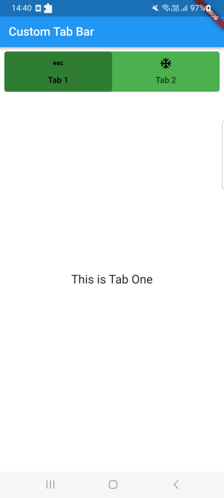
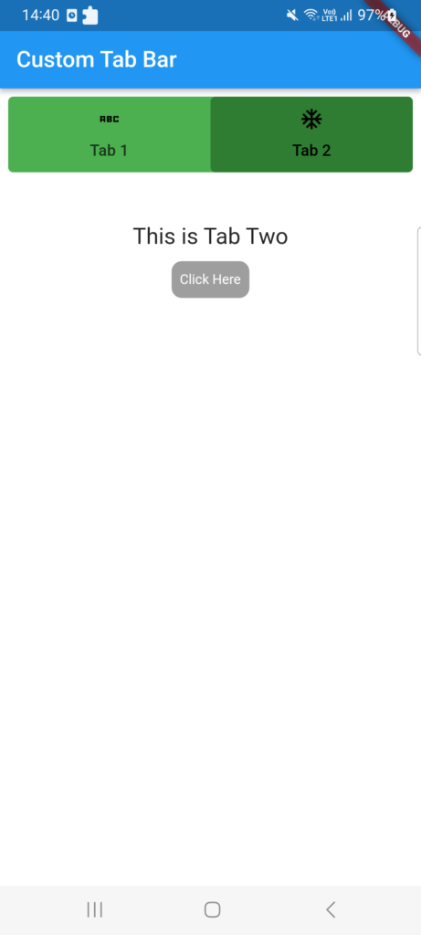
Custom Tab Bar in Flutter

This post will discuss custom tab bars and show you how to make tab bars inside of tab bars. Making a tab bar is extremely simple; all you need to do is return the default controller, specify the length, and build the tab bar. You can also refer this article of Work with Tabs.

While Flutter comes with a default TabBar widget, there may be times when you want to design or programme an own tab bar. This tutorial will show you how to design a unique tab bar in Flutter.

However, in this post, we’ll look at how to make a tab bar, customise it to suit your needs, and add a subtab bar to it.

The tabbar is one of the most popular widgets in the flutter app, and most businesses favour using it in their software.

Open the lib/main.dart file and replace its contents with the following code:

import 'package:flutter/material.dart';

void main() {
  runApp(MyApp());
}

class MyApp extends StatelessWidget {
  @override
  Widget build(BuildContext context) {
    return MaterialApp(
      title: 'Custom Tab Bar',
      theme: ThemeData(
        primarySwatch: Colors.blue,
      ),
      home: MainCustomTab(),
    );
  }
}

In this code, we’ve created a basic MyApp widget that sets up the Flutter app’s structure. The MainCustomTab widget is set as the home screen.

Implementing the Custom Tab Bar

Create a new file called main_custom_tab.dart in the lib directory and add the following code:

import 'package:flutter/material.dart';

class MainCustomTab extends StatefulWidget {
  @override
  State<MainCustomTab> createState() => _MyCustomState();
}

class _MyCustomState extends State<MainCustomTab> {
  @override
  Widget build(BuildContext context) {
    return DefaultTabController(
      length: 2,
      child: Scaffold(
        backgroundColor: Colors.white,
        appBar: AppBar(
          title: Text("Custom Tab Bar"),
          automaticallyImplyLeading: false,
        ),
        body: Padding(
          padding: const EdgeInsets.all(8.0),
          child: Column(
            crossAxisAlignment: CrossAxisAlignment.start,
            children: [
              Container(
                decoration: BoxDecoration(
                  borderRadius: BorderRadius.circular(5),
                  color: Colors.green,
                ),
                child: TabBar(
                  indicator: BoxDecoration(
                    color: Colors.green[800],
                    borderRadius: BorderRadius.circular(5),
                  ),
                  labelColor: Colors.black,
                  tabs: [
                    Tab(
                      child: Text("Tab 1"),
                      icon: Icon(
                        Icons.abc_sharp,
                        color: Colors.black,
                      ),
                    ),
                    Tab(
                      child: Text("Tab 2"),
                      icon: Icon(
                        Icons.ac_unit_sharp,
                        color: Colors.black,
                      ),
                    ),
                  ],
                ),
              ),
              Expanded(
                child: TabBarView(children: [
                  MyTabOne(),
                  MyTabTwo(),
                ]),
              )
            ],
          ),
        ),
      ),
    );
  }
}

class MyTabOne extends StatelessWidget {
  const MyTabOne({super.key});

  @override
  Widget build(BuildContext context) {
    return Center(
        child: Text(
      "This is Tab One",
      style: TextStyle(fontSize: 20),
    ));
  }
}

class MyTabTwo extends StatelessWidget {
  const MyTabTwo({super.key});

  @override
  Widget build(BuildContext context) {
    return Container(
      color: Colors.white,
      margin: EdgeInsets.fromLTRB(0, 50, 0, 0),
      child: Column(
        children: [
          Center(
              child: Text(
            "This is Tab Two",
            style: TextStyle(fontSize: 20),
          )),
          Container(
            padding: EdgeInsets.fromLTRB(5, 0, 5, 0),
            margin: EdgeInsets.fromLTRB(5, 5, 5, 0),
            child: TextButton(
              style: TextButton.styleFrom(
                shadowColor: Colors.black,
                textStyle: TextStyle(fontSize: 20),
                primary: Colors.white,
                shape: RoundedRectangleBorder(
                  borderRadius: BorderRadius.circular(10.0),
                ),
                backgroundColor: Colors.grey,
              ),
              onPressed: () async {
                print("Click Here");
              },
              child: Text(
                "Click Here",
                style: TextStyle(color: Colors.white, fontSize: 12),
              ),
            ),
          ),
        ],
      ),
    );
  }
}

I’ve written all of my code in this file, but you could make a separate file for that.

Output:

In this article, we learnt how to use the TabBar and TabBarView widgets to build a custom tab bar in Flutter.

We looked into altering the tab bar’s visual style and showed various content on each tab. Feel free to play around with various layouts and improve the usability of your personalised tab bar.

Related Posts

Bottom Tab Bar in Flutter

Tabbar with image in flutter

Simple Tabbar in Flutter

Progress Bars Example in Flutter

Bottom Tab Bar in Flutter

For navigating between various UIs, the BottomNavigationBar has gained popularity in recent years.

Since the majority of apps now use this widget to switch between screens, many developers use bottom navigation.

Flutter’s bottom navigation bar can include a variety of things, including text labels, icons, or both.

It enables easy switching between an app’s top-level views for the user. It is preferable to use a side navigation bar while utilising a larger screen.

In Flutter applications, the scaffold widget is typically set in conjunction with the bottom navigation bar. To set the bottom navigation bar, use the Scaffold widget’s Scaffold.bottomNavigationBar parameter.

It should be noted that adding the BottomNavigationBar alone will not cause the navigation elements to appear. For Items properties that take a list of BottomNavigationItems widgets, the BottomNavigationItems property must be set.

BottomNavigationBar Widget properties

BottomNavigationBarItem({  
    @required this.icon,  
    this.title,  
    Widget activeIcon,  
    this.backgroundColor,  
  })

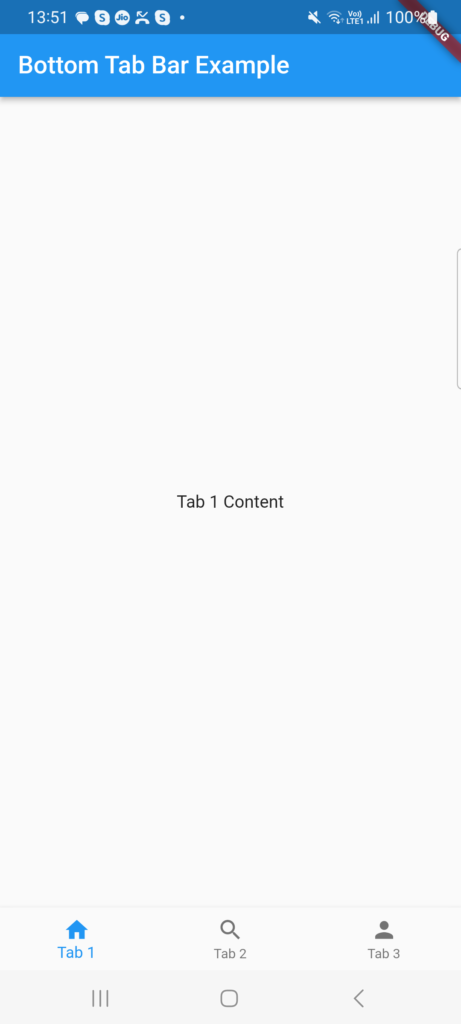
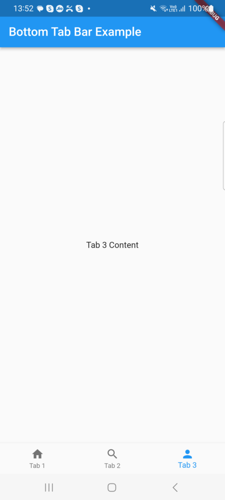
Creating the Bottom Tab Bar Example Given below:

Open the lib/main.dart file in your project directory and replace the code with the following:

import 'package:flutter/cupertino.dart';
import 'package:flutter/material.dart';

class TabbarDisplay extends StatefulWidget {
  @override
  TabbarDisplayState createState() =&gt; TabbarDisplayState();
}

class TabbarDisplayState extends State&lt;TabbarDisplay&gt; {
  int _currentIndex = 0;
  final List&lt;Widget&gt; _tabs = [
    Tab1(),
    Tab2(),
    Tab3(),
  ];

  @override
  Widget build(BuildContext context) {
    return Scaffold(
      appBar: AppBar(
        title: Text('Bottom Tab Bar Example'),
        automaticallyImplyLeading: false,
      ),
      body: _tabs[_currentIndex],
      bottomNavigationBar: BottomNavigationBar(
        currentIndex: _currentIndex,
        onTap: (index) {
          setState(() {
            _currentIndex = index;
          });
        },
        items: [
          BottomNavigationBarItem(
            icon: Icon(Icons.home),
            label: 'Tab 1',
          ),
          BottomNavigationBarItem(
            icon: Icon(Icons.search),
            label: 'Tab 2',
          ),
          BottomNavigationBarItem(
            icon: Icon(Icons.person),
            label: 'Tab 3',
          ),
        ],
      ),
    );
  }
}

class Tab1 extends StatelessWidget {
  @override
  Widget build(BuildContext context) {
    return Center(
      child: Text('Tab 1 Content'),
    );
  }
}

class Tab2 extends StatelessWidget {
  @override
  Widget build(BuildContext context) {
    return Center(
      child: Text('Tab 2 Content'),
    );
  }
}

class Tab3 extends StatelessWidget {
  @override
  Widget build(BuildContext context) {
    return Center(
      child: Text('Tab 3 Content'),
    );
  }
}

Explaination of that code

The root widget of the Flutter app created in this code is a MaterialApp. To control the status of the bottom tab bar, we construct a MyHomePage widget that extends StatefulWidget inside of it.

Users can switch between tabs by using the BottomNavigationBar widget, which is added to the Scaffold’s bottomNavigationBar property. Using BottomNavigationBarItem, we create three tabs, each with a label and an icon.

The currently chosen tab is tracked by the BottomNavigationBar’s currentIndex attribute. The state is updated and the current tab is modified by the onTap callback.

Each tab’s content is represented by a different widget (Tab1, Tab2, Tab3). For each tab, you can swap out these widgets with your own original content.

Output :

Related Posts

Tabbar with image in flutter

Simple Tabbar in Flutter

Progress Bars Example in Flutter

Creating a Splash Screen in Flutter

Remove DEBUG Banner in the Flutter app

Rounded Corners Image in Flutter

Tabbar with image in flutter

Good day, readers A few weeks ago, one of the readers who left a comment on my story requested that I write a piece regarding the TabBar and TabBarView widgets.

So here it is: in addition to addressing these two widgets, we will also speak about the DefaultTabBarController and TabController.

If you dont know how to implement basic Tabbar in Flutter you can check this post of the Simple Tabbar in Flutter.

You might concur with me that designing a tabbed layout in Android is more difficult than it is in Flutter if you are an Android developer.

The basic Syntax of the Tabbar is given below:

TabBar(           
  indicatorColor: Colors.white,
  indicatorWeight: 2.0,
  indicatorPadding: EdgeInsets.zero,
  indicatorSize: TabBarIndicatorSize.label,
  indicator: BoxDecoration(),
  labelColor: Colors.white,
  labelStyle: TextStyle(),
  labelPadding: EdgeInsets.only(top: 10.0),
  unselectedLabelColor: Colors.grey,
  unselectedLabelStyle: TextStyle(),
  isScrollable: false,
  controller: _tabController,  // only  if DefaultTabContoller is not used.
  dragStartBehavior: DragStartBehavior.start,
  mouseCursor: SystemMouseCursors.noDrop,
  physics: ScrollPhysics(parent: AlwaysScrollableScrollPhysics()),
  onTap: (){},
  tabs: [Tab(),]                 // @required list of Tabs

Here is the example of Image on Tabbar in Flutter Implementation.

Open the lib/main.dart file in your project directory and replace the code with the following:

class TabbarDisplay extends StatefulWidget {
  @override
  TabbarDisplayState createState() =&gt; TabbarDisplayState();
}

class TabbarDisplayState extends State<tabbardisplay> {
  @override
  void initState() {
    super.initState();
  }

  @override
  Widget build(BuildContext context) {
    return MaterialApp(
      home: DefaultTabController(
        length: 3, // Number of tabs
        child: Scaffold(
          appBar: AppBar(
            title: Text('Tech Android Hub'),
            bottom: TabBar(
              tabs: [
                Tab(
                  icon: Icon(Icons.add), // Image or Icon you can add 
                  text: 'Tab 1',
                ),
                Tab(
                  icon: Icon(Icons.access_alarm),
                  text: 'Tab 2',
                ),
                Tab(
                  icon: Icon(Icons.ac_unit_rounded),
                  text: 'Tab 3',
                ),
              ],
            ),
          ),
          body: TabBarView(
            children: [
              Center(child: Icon(Icons.add),),
              Center(child: Icon(Icons.access_alarm)),
              Center(child: Icon(Icons.ac_unit_rounded)),
            ],
          ),
        ),
      ),
    );
  }
}</tabbardisplay>

By using the icon attribute, we have modified the previous code in this example to add Icon widgets to each Tab. Alternatively, if you like, you can use a custom icon or any other icon from the Icons class.

The tabbed interface should now appear, with three tabs and an image on each one. Each tab’s associated image will appear in the centre of the screen when it is touched.

For creating complex user interfaces, Flutter offers a flexible and user-friendly framework. You are welcome to try different things, like as changing the graphics on the tabs or including new features in the app.

Related Posts

Simple Tabbar in Flutter

Progress Bars Example in Flutter

Creating a Splash Screen in Flutter

Remove DEBUG Banner in the Flutter app

Rounded Corners Image in Flutter

Simple Tabbar in Flutter

Mobile apps frequently employ tabs as a UI pattern because they make it simple for users to switch between various content parts.

The TabBar and TabBarView widgets in Flutter can be used to build a tabbed interface.

Tabs are precisely what you assume they are. When clicked, it’s a component of the user interface that directs the user through several paths (i.e., pages).

It is common practise to use tabs in applications. Using the material library and Flutter, tab layouts may be easily created. We will investigate the same in detail in this essay.

Make a new Flutter application now. Once the programme is finished, remove all the comments and content until you are left with the following code:

Design of TabController

The TabController, as its name suggests, manages each tab’s operation by synchronising its tabs and contents. One of the simplest methods for creating tabs in flutter is to use the DefaultTabController widget. Below are the full code of Tabbar :

class TabbarDisplay extends StatefulWidget {
  @override
  TabbarDisplayState createState() => TabbarDisplayState();
}

class TabbarDisplayState extends State<tabbardisplay> {
  @override
  void initState() {
    super.initState();
  }

  @override
  Widget build(BuildContext context) {
    return MaterialApp(
      home: DefaultTabController(
        length: 3, // Number of tabs
        child: Scaffold(
          appBar: AppBar(
            title: Text('Tech Android Hub'),
            bottom: TabBar(
              tabs: [
                Tab(text: 'Tab 1'),
                Tab(text: 'Tab 2'),
                Tab(text: 'Tab 3'),
              ],
            ),
          ),
          body: TabBarView(
            children: [
              Center(child: Text('First Tab 1')),
              Center(child: Text('Second Tab 2')),
              Center(child: Text('Third Tab 3')),
            ],
          ),
        ),
      ),
    );
  }
}

In this code, we create a new Flutter application with a MaterialApp as the root widget. Inside it, we use a DefaultTabController to handle the tab logic.

The TabBar widget is placed inside the AppBar and provides the tab titles. We create three Tab widgets, each with a different text label.

The TabBarView widget contains the content of each tab. In this example, we use simple Text widgets wrapped in Center widgets for demonstration purposes. You can replace them with your own content widgets.

You discovered how to use TabBar and TabBarView to build a tabbed interface in Flutter in this tutorial. In developing mobile applications, using tabs to organise content and improve user experience is a great strategy.

Feel free to play around with various content widgets and alter the tab’s layout to fit the style of your app. For building complex and interactive user interfaces, Flutter offers a flexible and user-friendly framework.

Happy coding!

Related Posts

Progress Bars Example in Flutter

Creating a Splash Screen in Flutter

Remove DEBUG Banner in the Flutter app

Rounded Corners Image in Flutter

Example of a checkboxlisttile in flutter

Progress Bars Example in Flutter

Introduce the idea of progress bars and their significance in a Flutter app for displaying the status of ongoing tasks or processes.

Draw attention to how progress bars can enhance user experience by giving visual feedback and informing users.

There are two different forms of progress indicators in Flutter: linear and circular.

Types of Progress Bars

Both indeterminate and determined indicators are available for linear and circular systems.

Until the procedure is finished, indeterminate operations show the indicator expanding and contracting continuously along the track.
Determined operations show the indicator’s width progressing with the process from 0 to 100% of the track.

We only need to call the widgets LinearProgressIndicator() or CircularProgressIndicator() to produce the Indeterminate. As a result, the indicator will run nonstop forever because we didn’t call the property value.

Here are a few progress bar examples :

Basic Linear Progress Bar Example

LinearProgressIndicator(
  value: 0.6, // Progress value between 0.0 and 1.0
  backgroundColor: Colors.grey,
  valueColor: AlwaysStoppedAnimation<Color>(Colors.blue),
)

Customized Linear Progress Bar Example

Container(
  height: 10,
  child: LinearProgressIndicator(
    value: 0.8,
    backgroundColor: Colors.grey,
    valueColor: AlwaysStoppedAnimation<Color>(Colors.green),
  ),
)

Circular Progress Indicator Example

CircularProgressIndicator(
  value: 0.5,
  backgroundColor: Colors.grey,
  valueColor: AlwaysStoppedAnimation<Color>(Colors.orange),
)

Indeterminate Progress Indicator Example

CircularProgressIndicator(
  backgroundColor: Colors.grey,
)

Progress message with linear progress indicator Example

Column(
  children: [
    LinearProgressIndicator(
      value: 0.6,
      backgroundColor: Colors.grey,
      valueColor: AlwaysStoppedAnimation<Color>(Colors.blue),
    ),
    SizedBox(height: 8),
    Text(
      'Upload All file...',
      style: TextStyle(
        fontSize: 16,
        fontWeight: FontWeight.bold,
      ),
    ),
  ],
)

These examples show how Flutter’s progress bars may be customised to include both linear and circular progress indications.

To complement the design of your app, you can alter a number of settings, including the progress value, colour, height, and backdrop colour.

Along with the progress bar, you can also include progress messages to give the user informative updates.

To construct the ideal progress bar for your app, feel free to change these examples to meet your individual needs and explore other customization options offered by Flutter.

I hope you found this Flutter lesson to be useful. Please check out this website’s other Flutter Project with Example if you’re interested in learning the language. Some of them come with video guides.

Related Posts

Creating a Splash Screen in Flutter

Remove DEBUG Banner in the Flutter app

Rounded Corners Image in Flutter

Example of a checkboxlisttile in flutter

Creating a Splash Screen in Flutter

You will learn in this article how to add a splash screen to your Flutter mobile application.

What do Splash Screens do?

A logo or phrase from a corporation is displayed on the splash screen, which serves as an introduction.

In order to make your Flutter-built mobile app appear more polished and user-friendly to users, it’s crucial to design a splash screen.

A simple white screen can give the app an unprofessional appearance. By giving a visual indicator that the software is loaded and lowering perceived wait times, a well-designed splash screen can also enhance user experience.

You might believe that most users just don’t care. Splash displays, however, do have an effect, even if only subconsciously. They establish the tone for both the user experience and the overall app concept.

Consider a splash screen to be the app’s welcome screen. They assist in alerting users about loading delays brought on by network problems or other errors. Because of all of this, developers need to be able to properly include a splash screen into their mobile applications.

Here is the basic example of Splash Screen.

class SplashScreen extends StatefulWidget {
  @override
  _SplashScreenState createState() => _SplashScreenState();
}

class _SplashScreenState extends State<SplashScreen> {
  @override
  void initState() {
    super.initState();
    // Add any initialization tasks or duration here
    // Example: Loading data, checking authentication, etc.
    // You can use a Timer to simulate a delay for demonstration purposes
    Future.delayed(const Duration(seconds: 3), () {
      setState(() {
        // Here you can write your code for open new view
        print("Splash Screen Done");
      });
    });
  }

  @override
  Widget build(BuildContext context) {
    return Scaffold(
      body: Center(
        child: FlutterLogo(
          size: 200,
        ),
      ),
    );
  }
}

To match the splash screen with the branding and user experience of their app, encourage readers to explore with various styles and customization possibilities.

Conclusion

The splashscreen plugin makes it simple to incorporate a splash screen into your programme. This tutorial’s main goal was to demonstrate how to add a splash screen to your Flutter application without touching the native code.

You now know how to make a splash screen with text, an image, and a loading indicator. Utilising the SplashScreen widget’s remaining parameters is now the difficulty.

Keep in mind that a pleasing splash screen might assist users feel more at ease while running your app. So, it also has advantages for mental wellness.

Just be aware that the splashcreen plugin’s capabilities are rather constrained. You’ll need to access the native code if you want complete control over how you design a customised splash screen. Still, this plugin works well for straightforward splash displays.

If you want to learn basic concept then refer this Flutter Basic Concept.

Additionally, you may view the flutter tutorials on our website.

Remove the Debug icon in Flutter

Rounded Corners Image in Flutter

Example of a checkboxlisttile in flutter

Checkbox Example In Flutter