
The Banner widget in Flutter offers a straightforward yet effective approach to overlay educational banners on the screens of your app while it is still in development.
These banners can give further context or serve as reminders in addition to helping to distinguish between various contexts, such as staging and production.
This guide will explain the Flutter Banner widget and provide you with an example of how to use it in your app.
What is the Flutter Banner Widget?
The Banner widget is a built-in Flutter widget that allows you to display a banner overlay in the top-right corner of your app’s screens.
It typically contains text that provides information or denotes the app’s current status or environment. This widget is especially useful during development, testing, or debugging phases to differentiate between different versions or to draw attention to certain aspects of the app.
Adding the Banner Widget to Your App
To add the Banner widget to your Flutter app, follow these steps:
Import the material.dart package: Ensure that you have imported the material.dart package in your Flutter project.
import 'package:flutter/material.dart';
Wrap your app with the Banner widget: Wrap your top-level widget, such as MaterialApp, with the Banner widget.
void main() {
  runApp(
    Banner(
      message: 'Development',
      location: BannerLocation.topEnd,
      color: Colors.red,
      child: MyApp(),
    ),
  );
}
In the example above, we wrap our MyApp widget with the Banner widget and provide the desired message, location, and color parameters.
Example Usage: Adding a Development Banner
Let’s imagine that you want to add a banner to your app that says “development” to let users know that the current build is a beta version.
By taking the procedures outlined above and personalising the message, location, and colour attributes to suit your tastes, you can do this.
Here it is Full Example of the Banner Tutorial
import 'package:flutter/material.dart';

class BannerMainDetails extends StatefulWidget {
  @override
  BannerDisplayState createState() => BannerDisplayState();
}

class BannerDisplayState extends State<BannerMainDetails> {
  @override
  Widget build(BuildContext context) {
    return Scaffold(
        appBar: AppBar(
          title: Text('Banner Widget Demo'),
          automaticallyImplyLeading: false,
        ),
        body: Center(
            child: Column(
          children: [
            Container(
              padding: const EdgeInsets.all(10),
              margin: EdgeInsets.fromLTRB(0, 25, 0, 0),
              child: Banner(
                message: 'New Arrival',
                location: BannerLocation.topStart,
                color: Colors.pink,
                child: Container(
                  height: 250,
                  width: 250,
                  color: Colors.green,
                  alignment: Alignment.center,
                  child: const Text('Normal Item'),
                ),
              ),
            )
          ],
        )));
  }
}
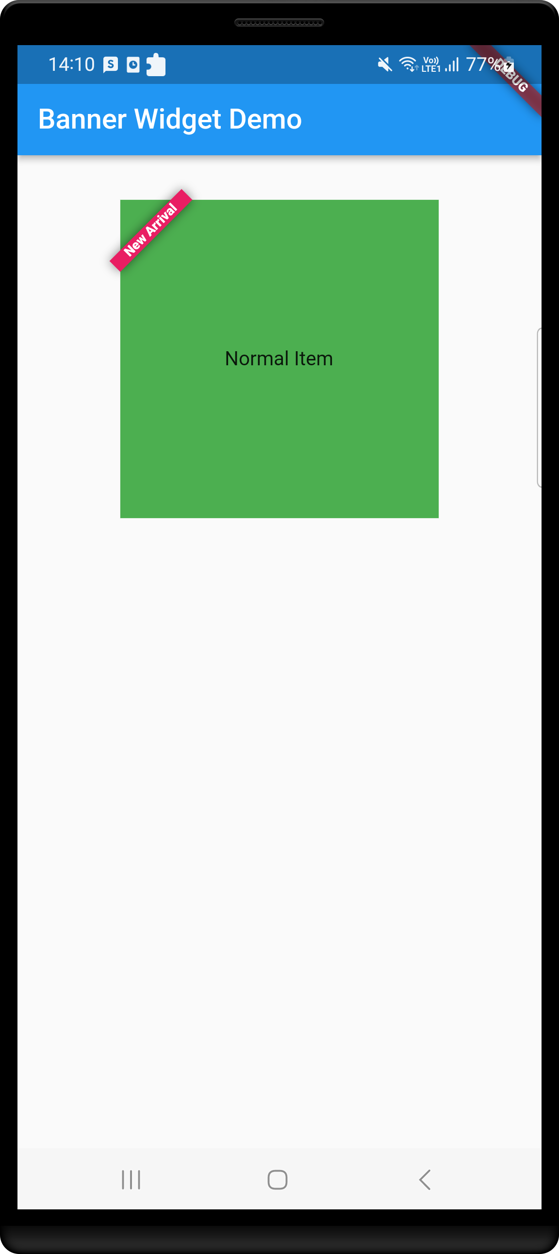
Here is the screenshot of this example.
Conclusion
You may improve your development process and provide your app useful information overlays by using the Flutter Banner widget.
The Banner widget offers a straightforward and efficient solution whether you want to distinguish between several versions, show the environment, or attract attention to particular features of your programme.
To best meet the requirements of your app and the development process, experiment with various banner messages, colours, and positions.
Utilise the Banner widget’s strength to boost the usability of your programme, the testing and debugging process, and the development process overall.
Related Posts
Passing Data Between Flutter Screens
Flutter App: Hide Keyboard on Tap
Prefix and Suffix Icon in TextField
Flutter TextField: Show/Hide Password
Retrieving the Value of a TextField
Multiline TextField in Flutter