Kotlin: First Element of an Array

Introduction

Kotlin is a modern programming language that has gained popularity for its concise syntax, interoperability with Java, and strong type system. In this tutorial, we’ll describe a common task in programming – retrieving the first element of an array in Kotlin. It will be great things need to understand. Whether you’re a beginner or an experienced developer, understanding how to work with arrays is fundamental to many programming tasks.

Arrays in Kotlin:

An array is a collection of elements of the same type, stored in contiguous memory locations. In Kotlin, you can create an array using the arrayOf() function. Arrays are zero-indexed, meaning the first element is at index 0, the second at index 1, and so on. So we need to get which data need to check.

Example Code:

fun main() {
    // Creating an array of integers
    val numbers = arrayOf(1, 2, 3, 4, 5)

    // Retrieving the first element
    val firstElement = numbers[0]

    // Displaying the result
    println("The first element of the array is: $firstElement")
}

Explanation

Creating an Array: In the example, we define an array named numbers using the arrayOf() function. The array contains the integers 1, 2, 3, 4, and 5.

Retrieving the First Element: To get the first element of the array, we use square brackets and specify the index 0. In Kotlin, array indices start at 0, so numbers[0] retrieves the first element of the array.

Displaying the Result: Finally, we print the result using println(). The output will be “The first element of the array is: 1” since 1 is the first element in our array.

Expanding Your Knowledge:

Arrays in Kotlin are versatile, allowing you to perform various operations. Once you’ve grasped the basics, consider exploring:

  • Array Iteration: Learn how to traverse through array elements efficiently.
  • Array Modification: Explore techniques to modify array elements dynamically.

Conclusion

Retrieving the first element of an array in Kotlin is a simple and common operation. Understanding array indexing is crucial for working with arrays effectively. Kotlin’s concise syntax and expressive features make it a great language for various programming tasks.

Related Posts

Array Elements of Specific Index

Creating Byte Arrays in Kotlin

Kotlin – Create String Array

Creating Integer Arrays in Kotlin

Create Empty Array in Kotlin

Creating Arrays in Kotlin

Mastering FlatButton in Flutter

In Flutter, FlatButton is typically used to display buttons that link to the application’s auxiliary features, such as viewing all of the files in the Gallery, launching the Camera, setting permissions, etc.

FlatButton has lost value. Please switch to TextButton.

In contrast to Raised Button, FlatButton lacks an elevation. Additionally, the button’s default colour is black with no colour for the text.

But you may use textColor and colour, respectively, to give the text and button colour.

The FlatButton widget in Flutter is a flexible element that enables you to design interactive and aesthetically pleasing buttons for the user interface of your app.

You may create buttons with adaptable attributes for different screen sizes and devices. In-depth discussion of the FlatButton widget and a step-by-step demonstration of how to add and style buttons to your Flutter applications are provided in this blog post.

Ensure you have Flutter installed on your machine. If not, follow the official installation guide. Create a new Flutter project.

Implement the FlatButton Widget

Inside the lib/main.dart file, replace the existing code with the following example:

import 'package:flutter/material.dart';

void main() => runApp(FlatButtonApp());

class FlatButtonApp extends StatelessWidget {
  @override
  Widget build(BuildContext context) {
    return MaterialApp(
      title: 'FlatButton Example',
      theme: ThemeData(
        primarySwatch: Colors.blue,
      ),
      home: FlatButtonExample(),
    );
  }
}

class FlatButtonExample extends StatelessWidget {
  void _onButtonPressed() {
    print('Button Pressed!');
  }

  @override
  Widget build(BuildContext context) {
    return Scaffold(
      appBar: AppBar(
        title: Text('FlatButton Widget'),
      ),
      body: Center(
        child: FlatButton(
          onPressed: _onButtonPressed,
          child: Text('Click Me!'),
        ),
      ),
    );
  }
}

Upon running the application, you will see a simple user interface with an AppBar and a centered FlatButton displaying the text “Click Me!”.

Explanation

In the code above, we create a new Flutter application named FlatButtonApp. Inside the FlatButtonExample widget, we use the FlatButton widget to create a button with the label “Click Me!”.

By providing an onPressed callback, we define the action to be executed when the user taps the button. In this example, the _onButtonPressed function simply prints “Button Pressed!” to the console.

Conclusion

The FlatButton widget in Flutter is a powerful tool for creating beautiful and responsive buttons in your app. By following the example provided in this blog post, you can easily incorporate flat-style buttons into your Flutter projects.

Experiment with different properties of the FlatButton widget, such as adjusting button colors, text styles, or adding icons, to create buttons that perfectly match your app’s design.

Unlock the potential of the FlatButton widget and elevate your user interface with visually stunning and interactive buttons in your Flutter applications.

Happy coding, and enjoy crafting captivating buttons for your Flutter app!

Related Posts

ElevatedButton Tutorial for Flutter

Numeric String Validation in Flutter

Border of Container Widget in Flutter

Flutter Column Explained – Tutorial

Flutter Progress Indicators Tutorial

Flutter Center Widget Tutorial

Passing Data Between Flutter Screens

Multiple pages or screens that need to communicate and share data with one another are frequent in Flutter app development.

Effective data sharing is crucial for building strong and linked Flutter apps, whether it be for user inputs, state information, or complex objects.

This blog article will discuss various methods and recommended practises for transferring data between Flutter pages, along with a real-world example.

Data Sharing Matters

Efficient data sharing is crucial for maintaining a seamless user experience and enabling smooth navigation within an app. By sharing data between pages, you can:

  1. Pass user inputs: Share user-provided information between pages to facilitate data entry or update operations.
  2. Preserve application state: Maintain the application’s state across different screens, ensuring a consistent user experience.
  3. Improve code organization: Avoid duplicating data or logic by sharing information between pages, leading to cleaner and more maintainable code.

Techniques for Sharing Data

Flutter offers a variety of methods for data transfer between pages.

Let’s examine some of the popular techniques using a real-world illustration:

Constructor-based Data Passing

One of the simplest ways to share data between pages is by passing it through constructors.

Each page can accept relevant data when navigating to it, allowing seamless communication between pages.

// Navigating to a new page with data
Navigator.push(
  context,
  MaterialPageRoute(
    builder: (context) => SecondPage(data: 'Hello from the first page'),
  ),
);

Inherited Widget

InheritedWidget is a powerful mechanism in Flutter that allows data to be propagated down the widget tree.

It enables efficient sharing of data across multiple levels of the widget hierarchy without explicitly passing it through constructors.

import 'package:flutter/material.dart';

// Define an InheritedWidget to share data
class MyData extends InheritedWidget {
  final String data;

  MyData({required this.data, required Widget child}) : super(child: child);

  // Create a static method to access the shared data
  static MyData? of(BuildContext context) =>
      context.dependOnInheritedWidgetOfExactType<MyData>();

  @override
  bool updateShouldNotify(MyData oldWidget) {
    return oldWidget.data != data;
  }
}

// Define a widget that uses the shared data
class ChildWidget extends StatelessWidget {
  @override
  Widget build(BuildContext context) {
    // Access the shared data using MyData.of(context)
    final myData = MyData.of(context);

    return Text(myData?.data ?? '');
  }
}

// Create a Flutter app
void main() {
  runApp(
    MaterialApp(
      home: Scaffold(
        appBar: AppBar(
          title: Text('InheritedWidget Example'),
        ),
        body: MyData(
          data: 'Hello from the parent widget!',
          child: ChildWidget(),
        ),
      ),
    ),
  );
}

In this example, we define an InheritedWidget called MyData that wraps the ChildWidget. The MyData widget has a data property that represents the shared data we want to pass down the widget tree.

To access the shared data in the ChildWidget, we use the MyData.of(context) static method, which searches for the nearest MyData widget in the widget tree above the current BuildContext.

By wrapping the ChildWidget with the MyData widget and providing the data property, we ensure that the ChildWidget can access and use the shared data.

When the shared data changes, the updateShouldNotify method is called, allowing widgets dependent on the MyData widget to update and rebuild if necessary.

This way, we can efficiently share and access data across different levels of the widget hierarchy using the InheritedWidget mechanism in Flutter.

Provider Package

The Provider package is a popular state management solution in Flutter that offers an elegant way to share data between pages.

It provides a simple and efficient way to manage and access shared data using a Provider and Consumer pattern.

First, make sure to add the Provider package to your pubspec.yaml file:

dependencies:
  flutter:
    sdk: flutter
  provider: ^5.0.0

Then, you can use the Provider package to share data between widgets in your Flutter app. Here’s an example:

import 'package:flutter/material.dart';
import 'package:provider/provider.dart';

// Define a data model class
class MyDataModel extends ChangeNotifier {
  String data = '';

  void updateData(String newData) {
    data = newData;
    notifyListeners(); // Notify listeners when the data changes
  }
}

void main() {
  runApp(
    ChangeNotifierProvider(
      // Wrap your app with the ChangeNotifierProvider
      create: (context) => MyDataModel(),
      child: MaterialApp(
        home: HomePage(),
      ),
    ),
  );
}

class HomePage extends StatelessWidget {
  @override
  Widget build(BuildContext context) {
    final myData = Provider.of<MyDataModel>(context); // Access the shared data

    return Scaffold(
      appBar: AppBar(
        title: Text('Provider Example'),
      ),
      body: Center(
        child: Column(
          mainAxisAlignment: MainAxisAlignment.center,
          children: [
            Text(myData.data),
            SizedBox(height: 16),
            ElevatedButton(
              onPressed: () {
                myData.updateData('New data'); // Update the shared data
              },
              child: Text('Update Data'),
            ),
          ],
        ),
      ),
    );
  }
}

In this example, we create a MyDataModel class that extends ChangeNotifier from the Provider package. This class represents the shared data that we want to access and update.

We wrap the ChangeNotifierProvider widget around our MaterialApp to make the MyDataModel available to all the descendant widgets. The create parameter inside ChangeNotifierProvider is responsible for creating an instance of MyDataModel and making it accessible throughout the widget tree.

Inside the HomePage, we use the Provider.of<MyDataModel>(context) method to access the shared data. The Provider.of method allows us to retrieve the nearest instance of MyDataModel from the widget tree.

We display the data property from the MyDataModel using a Text widget and provide a button that updates the shared data by calling the updateData method.

When the shared data is updated, the notifyListeners() method is called, which triggers a rebuild of the widgets that depend on the MyDataModel. This ensures that any widget consuming the shared data will reflect the latest changes.

By using the Provider package, we can easily share and manage data across multiple widgets in a Flutter app, while also benefiting from efficient state management and widget rebuild optimizations.

Best Practices for Data Sharing

To ensure smooth and efficient data sharing among pages, consider the following best practices:

  • Identify the most appropriate method based on your app’s complexity and requirements.
  • Minimize the amount of shared data to maintain clarity and avoid potential conflicts.
  • Encapsulate shared data in models or classes for better organization and readability.
  • Leverage proper state management techniques to handle shared data updates efficiently.
  • Consider the use of immutable data models to prevent unintended modifications.

Conclusion

Efficient data sharing is essential for building well-connected and robust Flutter applications. By implementing the right techniques and following best practices, you can seamlessly pass data between pages, maintain application state, and create a smooth user experience.

Experiment with different data sharing methods in Flutter and choose the approach that best suits your app’s architecture and requirements. Remember to prioritize code organization, readability, and maintainability to ensure a scalable and efficient development process.

Implement effective data sharing in your Flutter app today and create seamless and interconnected user experiences.

Related Posts

Flutter App: Hide Keyboard on Tap

Prefix and Suffix Icon in TextField

Flutter TextField: Show/Hide Password

Retrieving the Value of a TextField

Multiline TextField in Flutter

Clearing a TextField in Flutter

ConstraintLayout Example In Android

Android’s ConstraintLayout layout manager is strong and adaptable, enabling you to design intricate and responsive user interfaces.

It enables you to specify restrictions (relationships) across views so they can adjust to various screen sizes and orientations.

ConstraintLayout is a popular option for creating intricate and dynamic user interfaces since it performs better than nested layouts like RelativeLayout and LinearLayout.

Let’s look at an example of a login screen to see how ConstraintLayout is used. Let’s say we have a layout with a login button, two EditText fields for the user name and password, and more.

The ConstraintLayout must first be included to our XML layout file as the root element. The restrictions for each view can then be specified within the ConstraintLayout.

Here is the XML File of the layout.

<androidx.constraintlayout.widget.ConstraintLayout
    xmlns:android="http://schemas.android.com/apk/res/android"
    xmlns:app="http://schemas.android.com/apk/res-auto"
    android:layout_width="match_parent"
    android:layout_height="match_parent">

    <EditText
        android:id="@+id/usernameEditText"
        android:layout_width="0dp"
        android:layout_height="wrap_content"
        android:hint="Username"
        android:inputType="text"
        app:layout_constraintTop_toTopOf="parent"
        app:layout_constraintStart_toStartOf="parent"
        app:layout_constraintEnd_toEndOf="parent"
        app:layout_constraintWidth_default="percent"
        app:layout_constraintWidth_percent="0.7"
        />

    <EditText
        android:id="@+id/passwordEditText"
        android:layout_width="0dp"
        android:layout_height="wrap_content"
        android:hint="Password"
        android:inputType="textPassword"
        app:layout_constraintTop_toBottomOf="@+id/usernameEditText"
        app:layout_constraintStart_toStartOf="@id/usernameEditText"
        app:layout_constraintEnd_toEndOf="@id/usernameEditText"
        app:layout_constraintWidth_default="percent"
        app:layout_constraintWidth_percent="0.7"
        app:layout_constraintVertical_bias="0.2"
        />

    <Button
        android:id="@+id/loginButton"
        android:layout_width="wrap_content"
        android:layout_height="wrap_content"
        android:text="Login"
        app:layout_constraintTop_toBottomOf="@+id/passwordEditText"
        app:layout_constraintStart_toStartOf="@id/passwordEditText"
        app:layout_constraintEnd_toEndOf="@id/passwordEditText"
        app:layout_constraintVertical_bias="0.2"
        />

</androidx.constraintlayout.widget.ConstraintLayout>

We would set the login button’s top constraint to the bottom of the password field and its horizontal constraint to the centre horizontally in order to centre it and align it below the password field.

To fine-tune the positioning and behaviour of the views within the ConstraintLayout, we may also declare other constraints such as margin, aspect ratio, visibility, and more.

These limitations ensure that the views automatically alter their sizes and locations in response to changes in screen size or device usage.

Finally, ConstraintLayout offers an adaptable and effective method for creating responsive user interfaces in Android. You may design layouts that adjust to different screen sizes and orientations by specifying relationships between views.

Relative Layout Example In Android

One of the most used layout managers in Android programming is RelativeLayout.

It offers a versatile technique to position UI items in relation to one another or to the parent container. This enables the development of intricate and dynamic user interfaces.

Each view in a RelativeLayout is placed according to how it relates to other views.

Several properties, including alignParentTop, alignParentBottom, alignLeft, alignRight, and others, are used to do this. We can design user interfaces (UIs) that adjust to various screen sizes and orientations by establishing these relationships.

Let’s look at an example to see how RelativeLayout is used. Consider a straightforward form that consists of a TextView, an EditText, and a Button. The TextView and Button should be positioned above and below the EditText, respectively.

Implementation in XML:
To utilize RelativeLayout, define it in XML layout files using the following syntax:

<RelativeLayout
    xmlns:android="http://schemas.android.com/apk/res/android"
    xmlns:tools="http://schemas.android.com/tools"
    android:layout_width="match_parent"
    android:layout_height="match_parent"
    android:padding="16dp"
    tools:context=".MainActivity">

    <!-- All Child views here -->

</RelativeLayout>

This may be done by giving each view in the RelativeLayout the proper layout properties.

The views will be dynamically positioned based on their relationships by utilising these layout parameters. This implies that the other views would automatically adjust if we were to modify the size or position of any view.

In Relative layout we can use other child view like Linearlayout or constrain layout or many other options.

RelativeLayout is especially flexible and gives a wide range of options.

RelativeLayout allows you to centre an element on the screen, centre it on the left, centre it in the middle of the screen, and more.

Because every child view is drawn by default at the top-left of the layout, you must specify each view’s location using one of the available layout attributes.

Linearlayout Example In Android

Android’s LinearLayout, a versatile ViewGroup subclass, offers developers an efficient and intuitive way to arrange child View elements in a linear fashion. You can check Linearlayout Example in Android Project.

By leveraging the orientation property, LinearLayout facilitates seamless organization of child views either horizontally or vertically. With its ability to create single or multi-row, multi-column layouts, LinearLayout proves to be an indispensable tool for crafting dynamic and visually appealing user interfaces.

All the child elements arranged one by one in multiple rows and multiple columns And you can create Userfriendly UI.

Horizontal list: One row, multiple columns.
Vertical list: One column, multiple rows.

Advantages of LinearLayout:

  1. Simplicity: LinearLayout provides a straightforward and intuitive approach to arranging child views in a linear manner, reducing the complexity of UI development.
  2. Flexibility: Developers have the freedom to adjust the orientation as needed, allowing for adaptable and responsive layouts based on the specific requirements of the application.
  3. Dynamic Layouts: LinearLayout enables the creation of dynamic UIs by dynamically adding or removing child views at runtime.
  4. Efficient Resource Utilization: LinearLayout consumes minimal system resources, ensuring smooth performance and efficient memory management.

Implementation in XML:
To utilize LinearLayout, define it in XML layout files using the following syntax:

<LinearLayout
    xmlns:android="http://schemas.android.com/apk/res/android"
    android:layout_width="match_parent"
    android:layout_height="match_parent"
    android:orientation="vertical">

    <!-- All Child views here -->

</LinearLayout>

Android’s LinearLayout empowers developers to effortlessly create dynamic and well-structured user interfaces.

Its ability to arrange child views linearly, either horizontally or vertically, provides the foundation for crafting visually appealing and user-friendly layouts.

You can also check Edittext Example and Textview Example layout on XML File.

Practical Usage Scenarios:

  1. Navigation Bars: LinearLayout simplifies the construction of horizontal or vertical navigation bars, ensuring consistent spacing and alignment of navigation elements.
  2. Form Input Fields: By organizing form input fields vertically, LinearLayout enhances user experience and readability.
  3. Image Galleries: By implementing a horizontal LinearLayout, images can be arranged side by side, creating visually appealing image galleries.

With LinearLayout’s simplicity, flexibility, and efficiency, developers can optimize resource utilization while delivering an exceptional user experience. By harnessing the power of LinearLayout, developers can unlock the potential for innovative and intuitive UI designs.

Container Tutorial with Examples – Flutter

Container classes in flutter are convenient ways to combine common painting, positioning, and sizing of widgets.

A container can be used to store one or more widgets and position them on the screen according to our convenience. Basically, a container is like a box to hold its contents. A basic container element that stores a widget has a margin, which separates it from other contents.

The total container can have a border of different shapes, for example, rounded rectangles, etc. A container surrounds its child with padding and then applies additional constraints to the padded extent (including the width and height)

Syntax of Container Class given below

Container({Key key,
           AlignmentGeometry alignment, 
           EdgeInsetsGeometry padding, 
           Color color, 
           Decoration decoration, 
           Decoration foregroundDecoration, 
           double width, 
           double height, 
           BoxConstraints constraints, 
           EdgeInsetsGeometry margin, 
           Matrix4 transform, 
           Widget child, 
           Clip clipBehavior: Clip.none});

Here’s an example of using the Container class in Flutter:

import 'package:flutter/material.dart';

void main() {
  runApp(MyApp());
}

class MyApp extends StatelessWidget {
  @override
  Widget build(BuildContext context) {
    return MaterialApp(
      title: 'Container Example',
      home: Scaffold(
        appBar: AppBar(
          title: Text('Container Example'),
        ),
        body: Center(
          child: Container(
            width: 200,
            height: 200,
            color: Colors.blue,
            padding: EdgeInsets.all(16),
            margin: EdgeInsets.all(16),
            alignment: Alignment.center,
            child: Text(
              'Hello, World!',
              style: TextStyle(
                color: Colors.white,
                fontSize: 20,
                fontWeight: FontWeight.bold,
              ),
            ),
          ),
        ),
      ),
    );
  }
}

The Container class in Flutter provides a flexible and powerful way to manage the layout and appearance of UI elements.

It allows you to control dimensions, alignment, padding, margin, background color, and more. With its wide range of properties and customization options, the Container class is an essential widget for creating attractive and well-structured Flutter UIs.

TextView Implementation in Kotlin

Android app development, the TextView plays a crucial role in presenting textual information to the user. Whether it’s displaying static text, dynamic content, or even richly formatted text, the TextView is an indispensable user interface component.

A simple XML code of TextView in a layout is shown below.

mainactivity.xml

<LinearLayout xmlns:android="http://schemas.android.com/apk/res/android"
    android:layout_width="match_parent"
    android:layout_height="match_parent">

    <TextView
        android:id="@+id/text_view_id"
        android:layout_width="wrap_content"
        android:layout_height="wrap_content"
        android:text="Hi, How are you ?" />

</LinearLayout>

TextView supports multiline text display and provides options for controlling text wrapping and truncation.

We’ll demonstrate how to set the maximum number of lines, enable scrolling for long text, and implement ellipsis for text that exceeds the available space.

Additionally, we’ll explore the use of scrollable TextView containers for displaying large amounts of text. Now Please check below kotlin code.

MainActivity.kt

import android.os.Bundle
import android.widget.TextView
import androidx.appcompat.app.AppCompatActivity

class MainActivity : AppCompatActivity() {
    private lateinit var textView: TextView

    override fun onCreate(savedInstanceState: Bundle?) {
        super.onCreate(savedInstanceState)
        setContentView(R.layout.activity_main)

        textView = findViewById(R.id.textView)

        val content = "Welcome to Kotlin TextView!"
        textView.text = content
    }
}

TextView is a powerful component that plays a crucial role in presenting text-based information in Android apps. By mastering its implementation, you can create visually appealing and interactive text displays.

This blog post has provided an overview of TextView basics, text formatting and styling, user interaction, multiline text handling, and accessibility considerations.

Armed with this knowledge, you can now unleash the full potential of TextView in your Android applications.

Cardview In Androidx – Material Design

There are so many properties in Android Material Design. In this tutorial we discuss about cardview. In Material Design Cardview we can design so many things at creative way.

Cardview – It is a material design component in 2014. It is very easy to use and understand for android developers. The main pupose of cardview is a looking good interface in Listview and all other feature like images and text. You can also changed some color in cardview with allegant background and use in proper manner.

How to Implement Cardview in Android App?

First of all you have to add cardview support library in your build.gradle file. And then click on sync button in Android Studio. So After successfull added you can use cardview on your app. Below code of support library.

implementation 'androidx.cardview:cardview:1.0.0'

Now you can add cardview in your XML File.

<androidx.cardview.widget.CardViewxmlns:android="http://schemas.android.com/apk/res/android"
    xmlns:card_view="http://schemas.android.com/apk/res-auto"
    android:id="@+id/card_Data"
    android:layout_width="match_parent"
    android:layout_height="match_parent">

Now there are so many properties of cardview.

Give Effect of Cardview clickevent. Code given Below

android:clickable="true"
android:foreground="?android:attr/selectableItemBackground"

if you want to change cardview background color then use this code for the cardview.

card_view:cardBackgroundColor="#FFF" // (XML)

In JAVA

cardView.setCardBackgroundColor(Color.WHITE); // (JAVA)

Give Cardview Corner shape. Use this code

card_view:cardCornerRadius="7dp" // (XML)

In JAVA

[php] cardView.setRadius(0); // (JAVA) [/php]

If you want to give elevation of cardview. Then use this code

[php] card_view:cardElevation=”7dp” // (XML) [/php]

In JAVA

[php] cardView.setCardElevation(2.1f); // (JAVA) [/php]

Give content padding in cardview. Use below code.

[php] card_view:contentPadding=”7dp” // (XML) [/php]

In JAVA

[php] cardView.setContentPadding(30, 30, 30, 0); // (JAVA) [/php]

Wave Design Template Android App

Highlights of App:

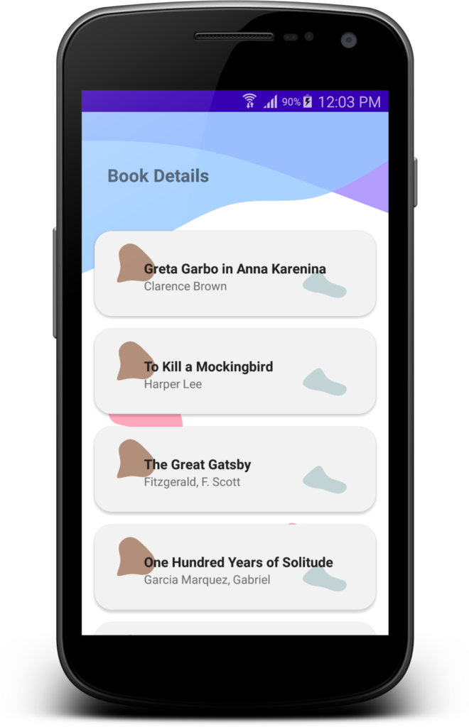
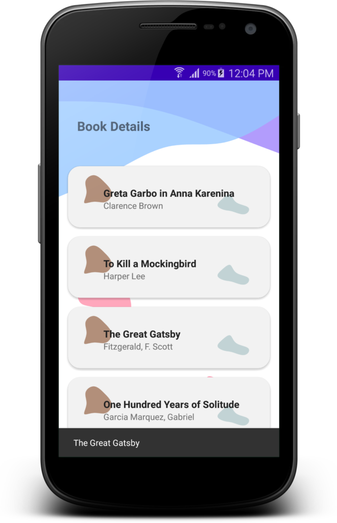
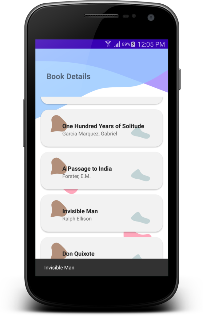
Wave Design Application is a Android Mobile Application. It has really clean and eye-catching interfaces with a perfect color scheme. In this App, I developed this

template for Android Developer who can develop waves android mobile application. It is very clear des‌ign of waves app.

In that App, I developed Cardview, RecycleView, XML Design of that App, Custom Adapter of Recycleview, Click Event of Cardview, Snackbar. Also Added Waves design and

Blob Design for New Interface of this App. So In that things So many feature we can develop on your App.

Screenshot of the App :

Wave Design Apk :

https://www.dropbox.com/s/2sma1nn4zlzaenq/Wave_Design_V1.apk?dl=0

I hope you can check this APK and Buy this project for create your projects.